Pic courtesy of Matthew Mann (the kid on the far right holding Micronauts #1) at Comics and Other Imaginary Tales.
Surveying the Gen X landscape and the origins of geek
Pic courtesy of Matthew Mann (the kid on the far right holding Micronauts #1) at Comics and Other Imaginary Tales.

The queue outside the Vogue Theatre in Vancouver for the first screening of Star Wars on June 24, 1977. (Photo: Glenn Baglo/Vancouver Sun)
Some seriously wide-bottomed pants were present at the event.
(Via the Ottawa Citizen)
The photos are from Martin Kennedy’s exquisite Sci-fi Art Tumblr. More at the link, and good luck getting any work done ever again.
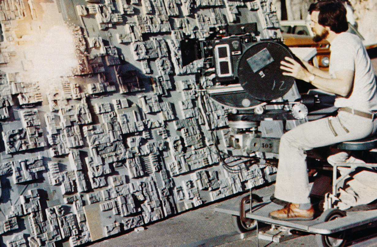
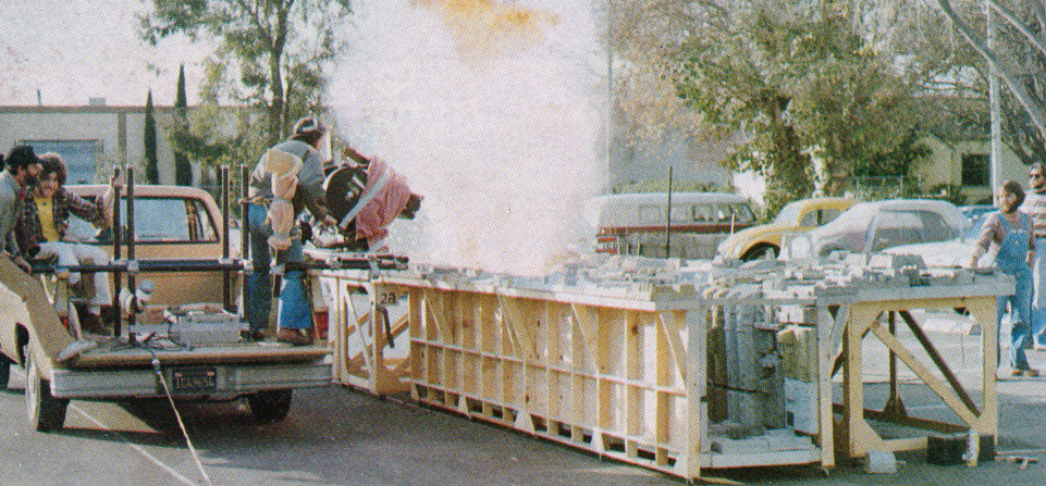
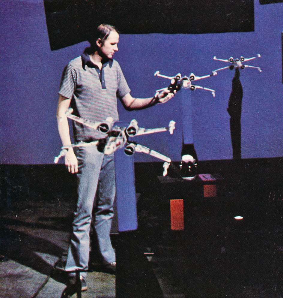
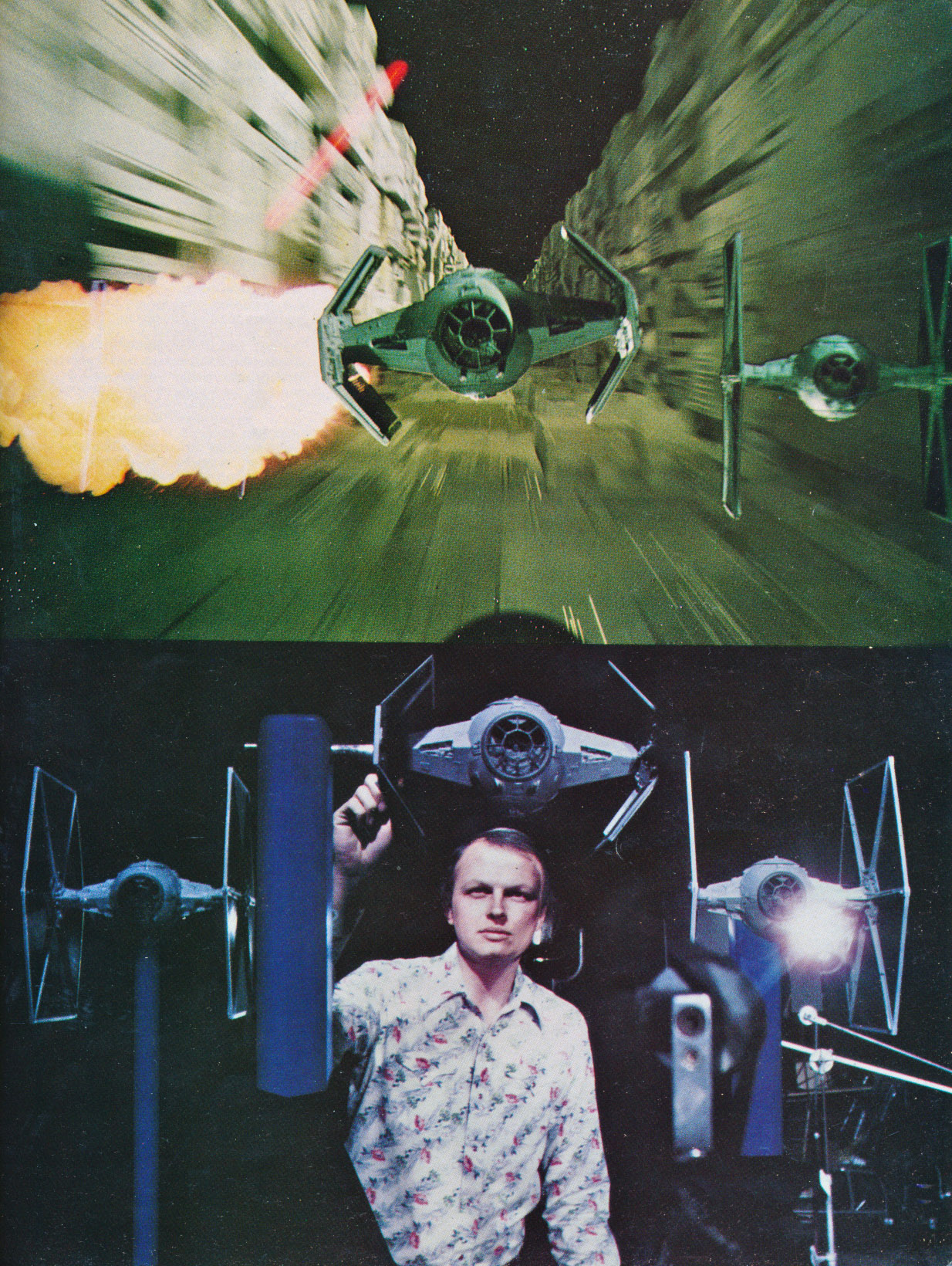
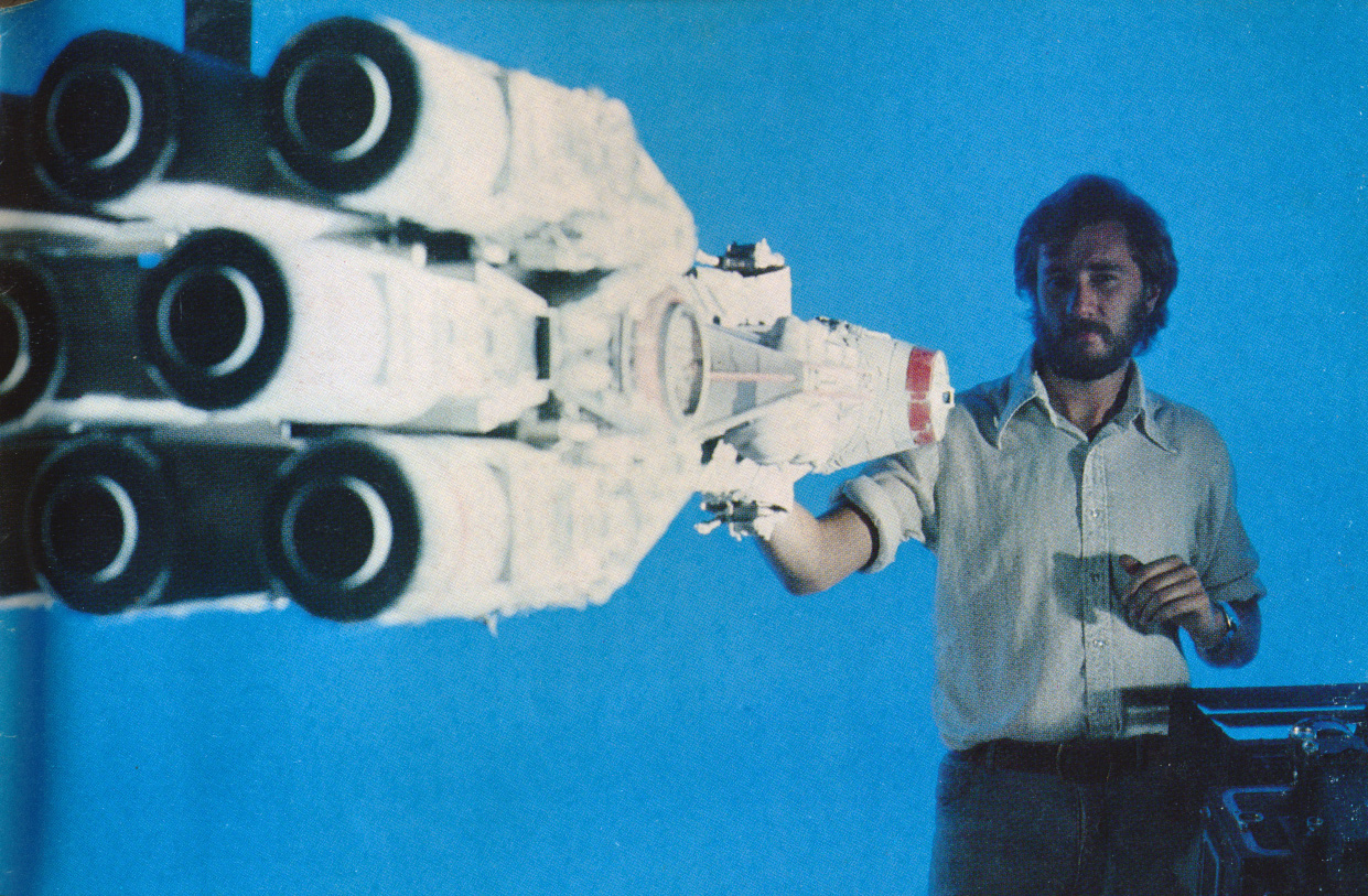
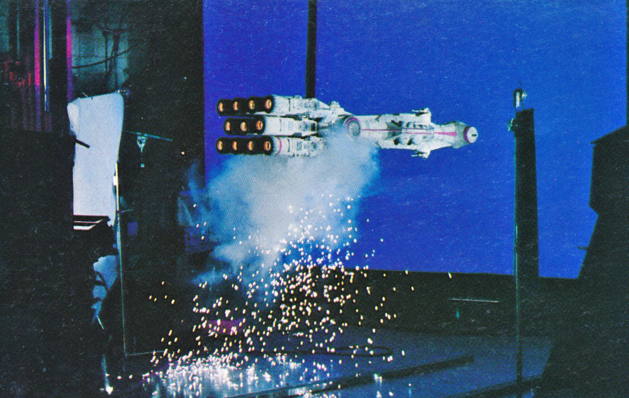
You see, from top to bottom, Richard Edlund filming Death Star explosions, Dennis Muren setting up X-Wing and Tie Fighter shots, and Joe Viskocil with the Blockade Runner. All of the guys were hand-picked by John Dykstra for Industrial Light & Magic, a little visual effects company founded by some guy named George Lucas in 1975.

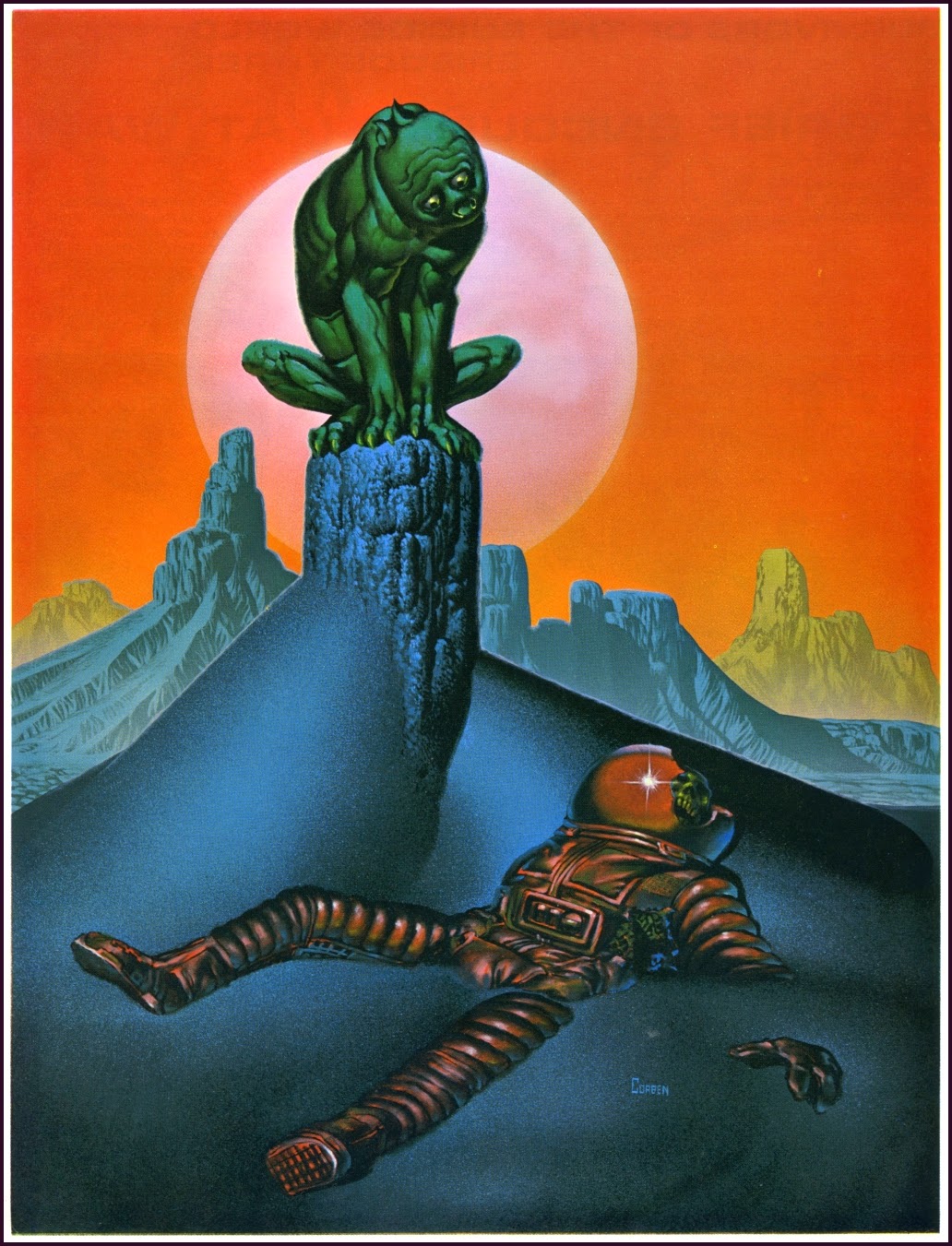
Front and back covers. Images are via The Golden Age. Corben is one of the greats, and what about that title design?

On the shortlist for my best movie posters of the ’80s, I slobbered over the VHS cover for years, even after watching the dull-as-post-apocalyptic-sand indie it was meant to (mis)represent. The artist is Rudy Obrero, who, aside from poster art (the pumped-up Mad Max 2 international one-sheet, for starters) and a massive amount of advertising art, was one of the defining illustrators on Mattel’s early Masters of the Universe packaging. He painted the box covers for the Wind Raider, Battle Cat, and Castle Grayskull, among others. (See an interview with Obrero at Poe Ghostal.)
The Def-Con 4 poster is not as original as I thought, however. The painting below is by Angus McKie and comes from the cover of The Year’s Best Science Fiction #8 (Sphere, 1976), as well as a British sci-fi/fantasy art tome called The Flights of Icarus (Paper Tiger, 1977). While Obrero’s changes to the original are pretty ingenious—the movie is about astronauts who return to a mutant-infested Earth after watching World War III unfold from space—there’s no doubt that the enduring motif is McKie’s.
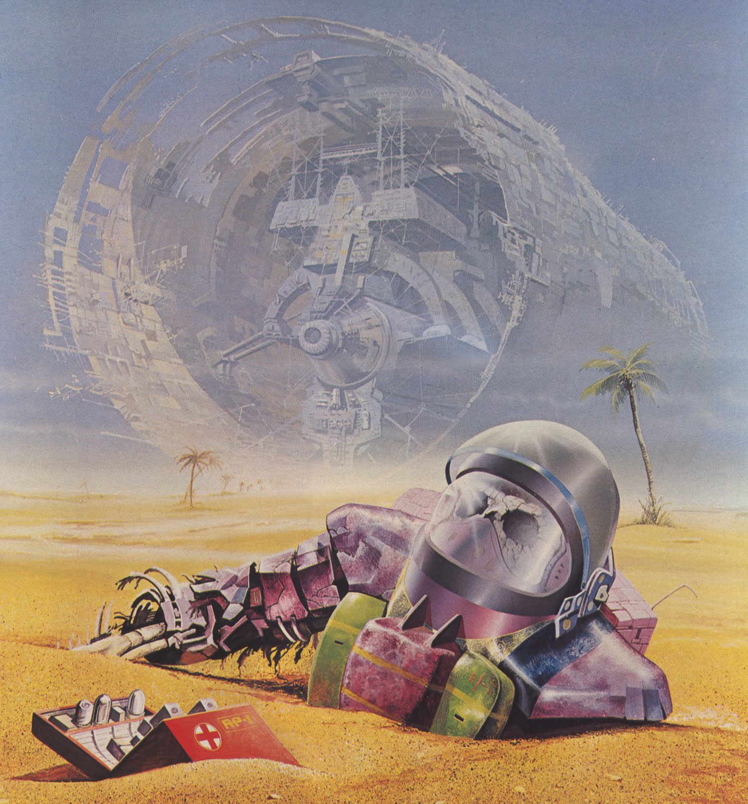
(Angus McKie art via Ski-Ffy, where you can see more work from Flights of Icarus)

From the ’82-’83 Quartz Hill High School yearbook. Quartz Hill is in California’s Antelope Valley, northeast of Los Angeles.
I do believe the gent in the middle is wearing a head armor piece and holding a wooden weapon of some kind. The gent to his left is holding the original AD&D Players Handbook. Is that a gorilla on his ringer tee?
The girl-guy ratio is damn near 50-50!
(Photo via QHHS Alumni)

Peter Max is an extremely influential illustrator who became a pop culture icon in the late ’60s and early ’70s, appearing on the cover of Life magazine and making TV appearances on The Ed Sullivan Show and The Tonight Show with Johnny Carson. His distinctive psychedelic patterns are instantly recognizable and look sort of like Rorshach tests exploding with color and undisguised positivity.
Here, on the other hand, is the poster for Library Week, 2014.

Pardon me for saying so, American Library Association, but your poster sucks. Where are the books, American Library Association, or is that screwed shut lime-green rectangle supposed to be one? Where is the color and excitement and movement indicative of a commitment to reading, American Library Association? What we have here, aside from the death of inspirational illustration, is a fatalistic collapse of integrity in the face of peddling technophiles and politicians who believe, or claim to believe (so long as the checks are rolling in), that long reading is no longer “relevant” in the digital era.
Hell, I guess we get the Photoshopped culture we deserve.
(Images via Open Culture and American Library Association)

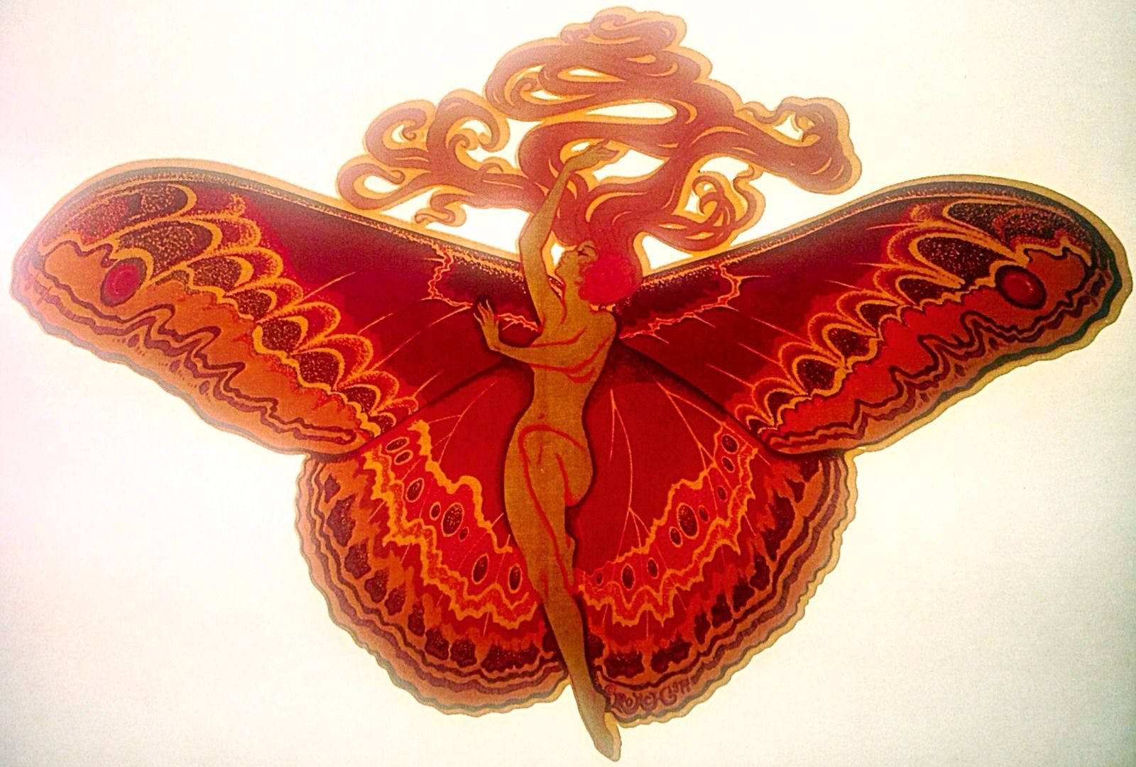
I can’t name a Chilton toy off the top of my head, but the illustration is beautiful, and so is the text arcing over it.