

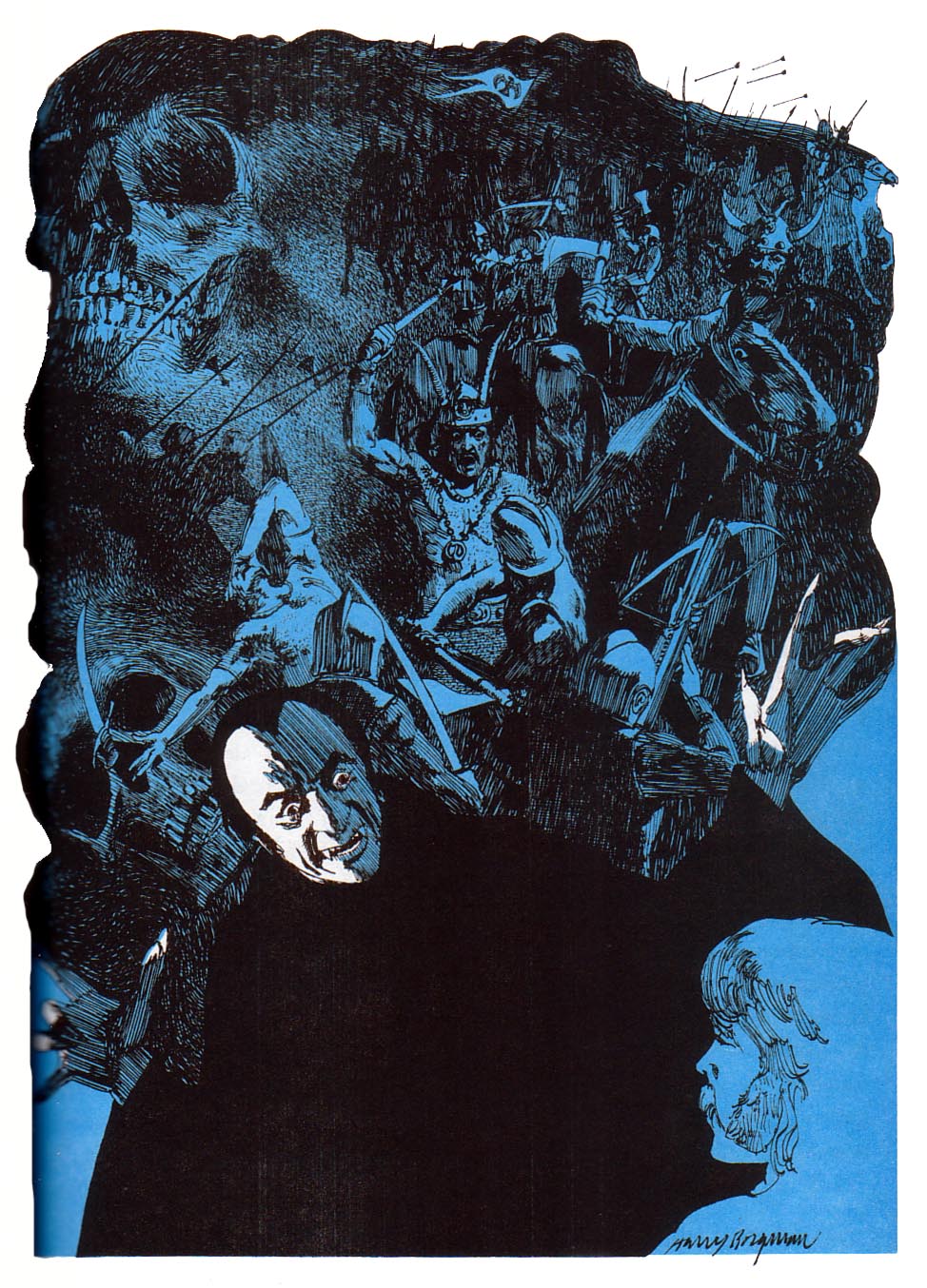
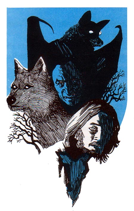

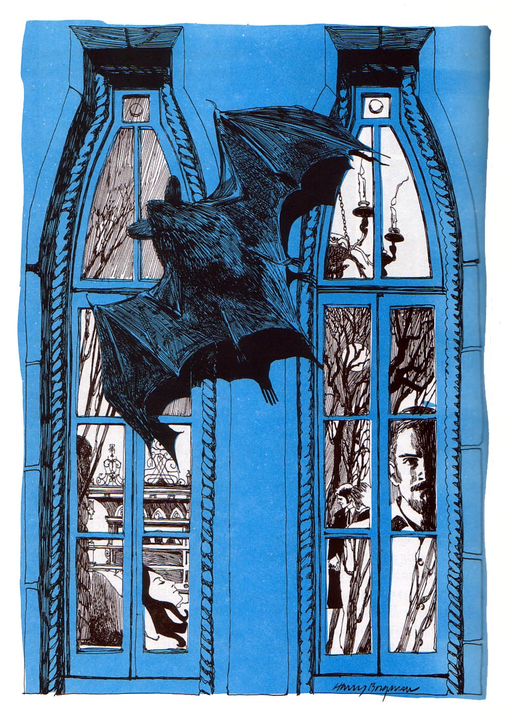

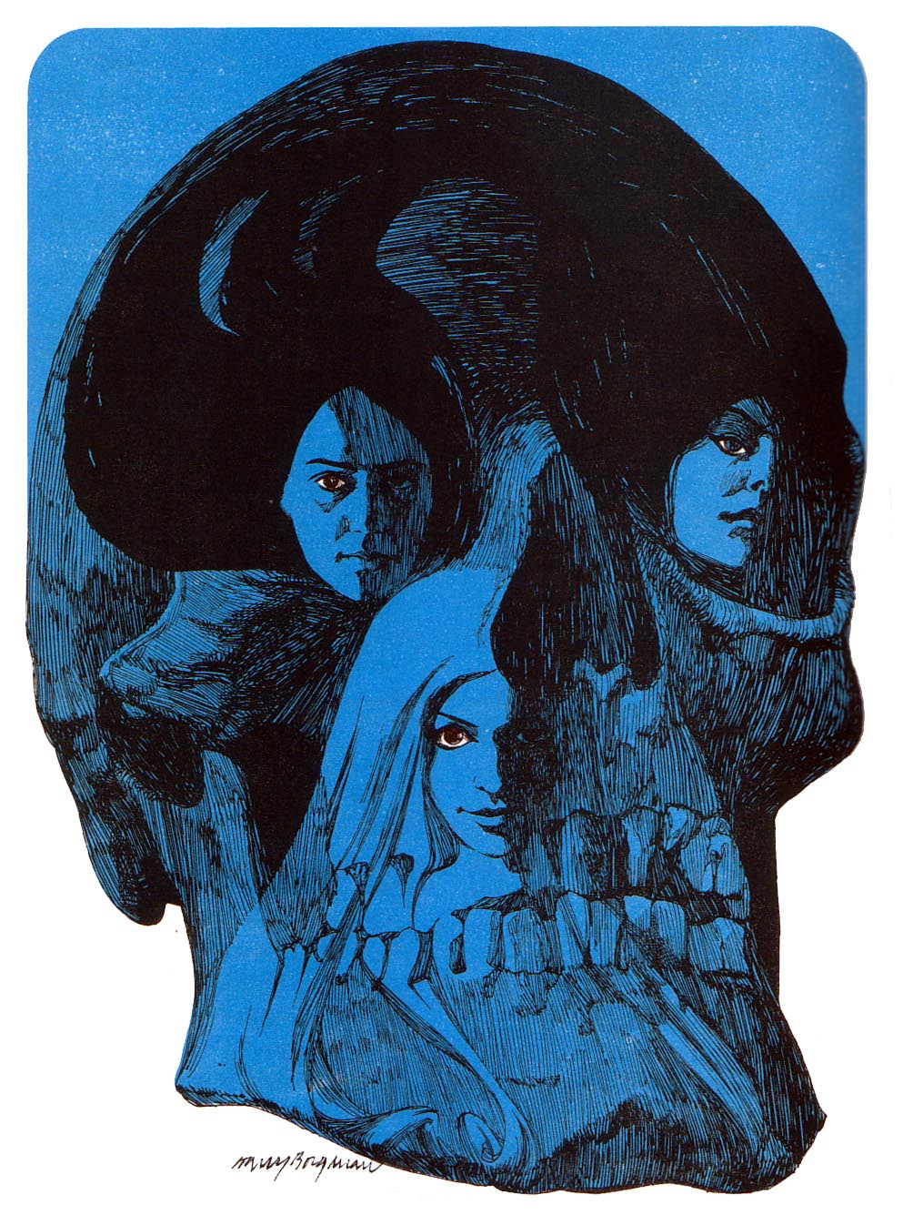
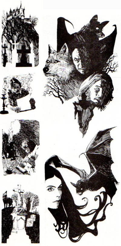
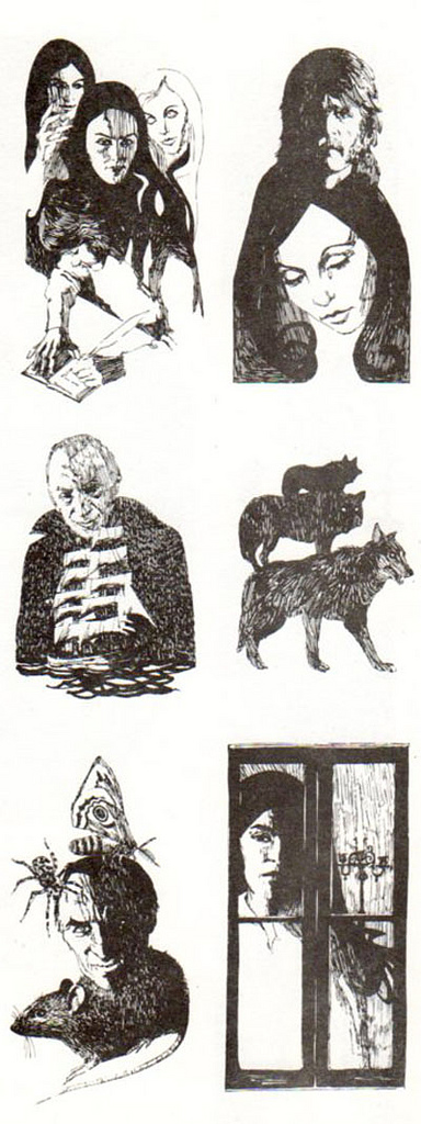
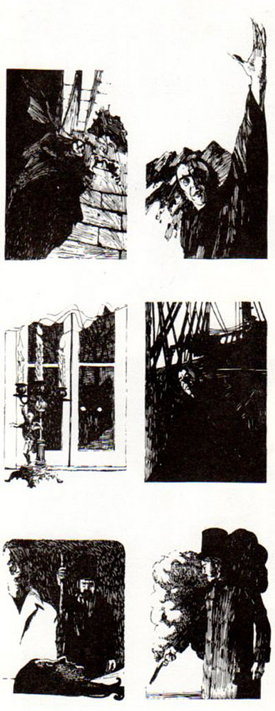
Great Tales of Horror and Suspense would be a superfluous anthology of famous horror stories if not for the extraordinary illustrations of Norman Nodel and Harry Borgman. Nodel painted the cover and did interior art for the first half of the book, while Borgman handled the exquisite line art for the Dracula section. See more of Borgman’s Dracula at And Everything Else Too. The black and white pages are from Borgman’s blog, where he talks about the assignment:
The art was rendered with a Crowquill pen with brush accents using India ink. It was a fun assignment and a real break from some of the Detroit automotive work that I was involved with at the time. Randy Mulvey, my New York [agent] during that period, landed this assignment for me as well as a series of Dracula paperback covers.
He goes into more detail about the gig in another post. I’ll post his Dracula covers later.


Awesome collection. The 2-color print scheme seems to have been really prevalent in ’50s and ’60s publications. Brush/pen skills are one thing, but it definitely takes some creativity and planning in order to balance and incorporate that second color (in this case, the blue) effectively.
Ah, yet in today’s case of CMD-Z and unlimited undos, such challenges are left to the wind. I have heard, though, that there’s been somewhat of a growing appreciation of hand-lettered forms lately, so who knows what the future holds…is it time for another renaissance?
Ive owned this book for over 40 years.The Water Ghost of Harrowby Hall was my favorite story.