Archive for the 'Books' Category


A Change of Hobbit Bookstore, 1974

Hobbit 1974

A Change of Hobbit, the dream-child of Sherry Gottlieb, opened as an unadvertised, 12-by-15-foot book closet above a coin laundry in Westwood Village in 1972, and closed in 1991 as probably “the largest and oldest science fiction bookshop in the world“—chased out of town by soaring rent and the big book chains. Seen in the postcard above is Hobbit’s second location (there were four in all) on Westwood Boulevard. Gottlieb, the Sylvia Beach of speculative fiction, tells her extraordinary story here.

Years ago I lived in Westwood, and at least once a week I would walk to the Domino’s Pizza on Westwood Blvd., order a small pepperoni, and walk across the street to browse the stacks at Border’s until I was ready to pick up the pizza. The “stacks” were decidedly neat and corporate, but it was the only book store within walking distance, and I am and always will be a book (front cover, back cover, printed paper in between) hound. That Domino’s Pizza (below) sits at the exact same address as A Change of Hobbit as seen in the postcard. I had no idea until I saw the photo.

Now all the bookstores are gone, and some people in high places seriously believe in an eyeless, mindless beast named post-literacy. Have a nice day.

Domino's

(Postcard image via Jordan Smith/Flickr)

Bob Pepper Cover Art for Harlan Ellison’s The Beast That Shouted Love at the Heart of the World (Signet, 1974)

Beast Ellison 1974

Pepper is a mad genius who painted art on the heart of the world.

(Image via Øyvind/Flickr)

Harlan Ellison’s Chocolate Alphabet, 1978

CA 1978-1

CA 1978-8

CA 1978-2

CA 1978-3

CA 1978-7

CA 1978-4

CA 1978-5

CA 1978-6

“From A to Z, in the Chocolate Alphabet” is a short story—a series of short shorts, really—written by Harlan Ellison and first appearing in The Magazine of Fantasy and Science Fiction (October, 1976). The inspiration for the story came from a Larry Todd painting called “N is for Nemotropin,” which Todd showed to Ellison in 1974 (see the title page above). Ellison wrote the story two years later while sitting in the window of the dearly departed A Change of Hobbit bookstore in Westwood, California.

The comic book adaptation was published by Last Gasp Eco-Comics in 1978, with Todd responsible for all artwork. The original “N is for Nemotropin” painting (below) appeared on the back cover. Note what Ellison calls Todd in the introduction: “one of America’s premier visual technicians.”

Nemotropin Todd

Tales of Fantasy by Larry Todd (Troubador Press, 1975) (Part Two)

TOF-1

TOF-Descent

TOF-3

TOF-4

TOF-6

TOF-7

TOF-8

TOF-9

TOF-10

TOF-17

TOF-11

TOF-12

TOF-13

TOF-14

TOF-15

TOF-16

TOF BC

In part one I give some background on the book and publisher Malcolm Whyte explains how it came to be. The material Todd covers is a very eclectic mix of ancient myth, fantasy, horror, sci-fi, pulp, children’s literature, and even poetry (Lewis Carroll, whose work was a drug culture keystone). Many of the works represented, including Lovecraft’s Dream Cycle, had recently seen new editions as part of Ballantine’s popular Adult Fantasy series.

Peter Max’s National Library Week Poster, 1969

Peter Max 1969

Peter Max is an extremely influential illustrator who became a pop culture icon in the late ’60s and early ’70s, appearing on the cover of Life magazine and making TV appearances on The Ed Sullivan Show and The Tonight Show with Johnny Carson. His distinctive psychedelic patterns are instantly recognizable and look sort of like Rorshach tests exploding with color and undisguised positivity.

Here, on the other hand, is the poster for Library Week, 2014.

Library 2014

Pardon me for saying so, American Library Association, but your poster sucks. Where are the books, American Library Association, or is that screwed shut lime-green rectangle supposed to be one? Where is the color and excitement and movement indicative of a commitment to reading, American Library Association? What we have here, aside from the death of inspirational illustration, is a fatalistic collapse of integrity in the face of peddling technophiles and politicians who believe, or claim to believe (so long as the checks are rolling in), that long reading is no longer “relevant” in the digital era.

Hell, I guess we get the Photoshopped culture we deserve.

(Images via Open Culture and American Library Association)

The Art of Earl Norem: G.I. Joe: A Real American Hero #3 – Fool’s Gold (Ballantine, 1988)

Norem Fool's Gold 1988

Norem Fool's Gold 1988-2

Norem painted the covers for all six of Ballantine’s G.I. Joe young adult novels, having previously illustrated covers and/or interiors for a number of G.I. Joe storybooks, two of which can be seen in full at Geektarded.

Even in space, apparently, Cobra agents are required to keep their noses and mouths covered.

(Images via Comic Art Fans and Yo Joe!)

When the Future Was Full of Stars: An Interview with David Jefferis

Jefferis WoFuture a

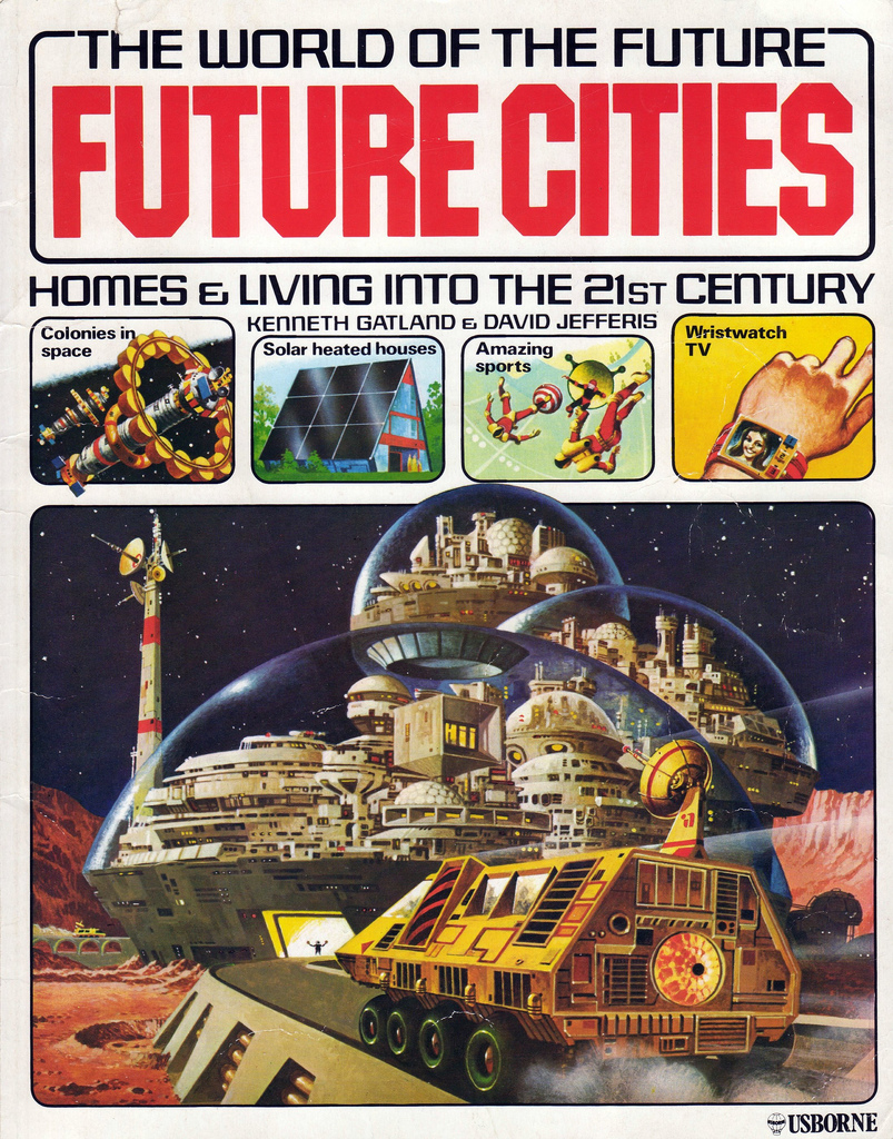
Unpublished cover art by the late Brian Lewis for World of the Future: Future Cities, 1979. A similar but revised piece was used for final publication.

Serious study of and public interest in space colonization peaked in the 1970s, fueled by the successes of the Apollo program and a youth culture that embraced the speculative sci-fi of Star Trek and 2001: A Space Odyssey. If the idea of hitching a ride on an asteroid outfitted with nuclear motors was utopian, it was also grounded in good sense: by the end of the turbulent 1960s, it was clear to many that the Earth was no longer a place that supported intelligent, compassionate life.

A number of books on the subject helped to launch “space activism” in the popular imagination, starting with Princeton physicist Gerard O’Neill‘s The High Frontier: Human Colonies in Space (1976). Due largely to O’Neill’s efforts, Stanford University and NASA collaborated to produce a series of detailed studies on permanent space settlements that continue to inspire the present-day pioneers behind SpaceX and the National Space Society.

In 1979 Usborne’s landmark The World of the Future series, penned by David Jefferis and the late Kenneth Gatland, presented youngsters with a vivid, exciting, and ultimately uplifting vision of the future—many of the authors’ predictions came true, as well. Even today, the books hold up the notion that living a better life among the stars is not just a worthy aspiration, but a worthy aspiration within reach.

* * *

Usborne Future-1Usborne Star Travel019Usborne Robots-2

* * *

2W2N: How did you get involved with Usborne Publishing? I notice that you were responsible for art and editorial direction on the World of the Unknown series before you worked on the World of the Future series.

JEFFERIS: Some background, prior to my Usborne days:

My first job was in London, in the Art Department of The Observer Sunday newspaper, producing news graphics—maps, diagrams, drawings, charts—to highlight stories for printing in the newspaper’s weekly edition. I was soon involved in other aspects of the production, such as magazine covers, and started to create features of my own, including articles for the “Young Observer” page, DIY hi-fi systems, and so on.

One such “Young Observer” article was an interview I carried out with a Brixton man who was building a man-powered helicopter in his (small) front sitting room. He had to disassemble his machine to extract it from the front parlour, but did go on to screw it together again and test it on an airfield. Sad to say, he managed only a short hop off the ground. Enterprising though, and I hugely respected his tenacity and skill in creating something from nothing.

I worked part-time for The Observer after a while, during which time I did many illustration jobs, and this brought me into the world of book publishing, and children’s books, for which there was steady demand for the realistic art I produced. I worked with  Macdonald Publishing quite a lot, and specialized in creating pre-World of the Future “science faction” futurist spreads in their non-fiction titles.

KONICA MINOLTA DIGITAL CAMERA

From a 1977 Observer magazine released to coincide with the London Auto Show. Jefferis: “The city car resulted from a concept-crunching session with journalist Peter Deeley, and included a joystick instead of a steering wheel, full-auto drivetrain, electric drive with slot in-out batteries (you weren’t first, Tesla!) and rear-facing back seats…”

I met Peter Usborne as one of a number of editors and publishers I had targeted as possible backers for a magazine concept I created called Science Fiction Illustrated. This starred the 1950s comic hero, Dan Dare, Pilot of the Future, on the cover, and—as all such things were in those days—the sample dummy for Science Fiction Illustrated was crafted by hand (mine, in this case!) with rub-down Letraset headlines, and so on.

Peter and I got on well, though he was not interested in being a periodical publisher. Some time later, an editor who worked with him in his newly-formed Usborne Publishing company gave me a call, and I started working as a freelance designer for the company.

I had offices in Covent Garden at the time—and had published the weekly “Tuesday Paper” for children there, along with other projects, such as “Lightning” for the National Magazine Company—so working in league with Usborne was a fairly natural next step, especially as our respective offices were on the same side of the street, opposite the Garrick Club.

Freelance design turned into art direction, which turned into art and editorial direction for the first Usborne book series in my charge, a five-title set called Battlegame Books. Later multi-title series—by which time I was on the payroll in charge of science, technology, and gee-whiz titles—included Young Scientist, Young Engineer, and as you noted, World of the Unknown.

2W2N: On the World of the Unknown books, what exactly did “art and editorial direction” entail? Did you do some of the illustrations as well? I’m also curious how the project was conceived. On the one hand, the art draws out the shocking and graphic nature of the subject matter (especially in All About Monsters); but on the other hand, the narrative is even-handed, even skeptical, and the tone is almost droll at times. It reminds me of the brilliant Hammer horror films of the ’60s and ’70s. Was that the idea?

JEFFERIS: The A&ED title is one that I invented, as I covered both named roles, rather than being responsible for either art or editorial.

I did a few small illustrations for these Usborne books, just fillers really as there wasn’t time to do more. Also, I had made a decision to move away from full-time freelance illustration, as it was so labour intensive and demanded too much time spent with only a drawing board for company. As quite a physical person, I wasn’t keen on the endless hours hunched up indoors, particularly with the amount of intensive preparation and repetitive work that my style of airbrush art demanded.

I’ll tell you how the change of direction happened. I was working on a “future faction” spread for Macdonald Publishing, the subject an underwater fish farm, with aquanauts zipping along, dolphins equipped with sensor packs, work domes, mini-subs, and so on. The background to the work was, naturally enough, a luminous blue-green ocean, fading into the distance. I sprayed endless fine coats with the airbrush, each layer just molecules thin, as I slowly built up the colour depth. For some reason, I hadn’t worn my surgical mask this time—and so I spent much of the following week sneezing and coughing out blue-green ink. Ugh. Today, health and safety would have words to say, and even then I didn’t feel like repeating that mistake again! The artwork looked okay though.

So far as World of the Unknown is concerned, the tone of the books fitted in with the nature of a then-new educational publisher. The idea was to draw readers in with bold visuals, then be responsible with what we were saying. It wasn’t actually defined as such, but there was an echo of the old Eagle comic there, which had done a similar sort of thing. My own book series featured mostly realistic artwork, but other Usborne output used humorous illustrations, produced by artists such as the late Stephen Cartwright.

Usborne Ghosts-1

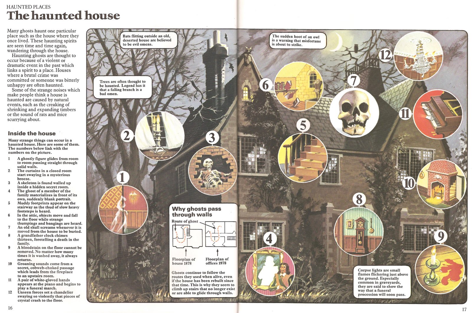
Two-page haunted house spread from The World of the Unknown: All About Ghosts, 1978

What was deliberately avoided was a true strip cartoon approach. The British educational establishment of the day was mostly dead-set against anything that looked too much like a comic, as were educational book publishers. That said, Stephen Cartwright’s gently amusing art became hugely successful in books aimed at younger readers, and rightly so.

Two tales of World of the Unknown spring to mind. In All About Ghosts, one spread featured the village of Pluckley in Kent, a place reputedly packed with supernatural phenomena. Writer Chris Maynard spent time there with a photographer, but they didn’t see or take any pictures of any spooks, and it took some head-scratching and burning of the midnight oil back in London for us to end up with a useable spread! It’s worth worth pointing out my methodology there, which was to work with contributors, aiming for a team effort.

On All About Monsters, I spent several days around Loch Ness looking for the mysterious beast, with no convincing results. The art I commissioned from Malcolm McGregor looked extremely good, but the printed results of my own researches came to no more than a couple of pics and a mini-map! I revisited the subject recently, and produced a prototype eBook, The REAL Loch Ness Monster, available here.

Usborne Monsters-1

Detail from The World of the Unknown: All About Monsters, 1978

This time Nessie was the solitary star and focus of the book, so it was good to do some in-depth research. Just as important, the research paid off with a scientifically elegant and believable theory—of which the Oxford University experts approved!

In the early days, I did visuals for every page, breaking down information into the box-by-box sequence approach being pioneered at Usborne. There were plenty of variations used at Usborne for other series and titles. For example, the illustrator Colin King did his own pencil roughs when working with in-house editor-writer Judy Hindley on How Your Body Works.

In summary, my titles may have been aimed at young readers, but they didn’t talk down to them, the text level being easy to understand, but not stupid. The information in a typical book could have been published in any intelligent, mid-market newspaper.

2W2N: You wrote the World of the Future series with the late Kenneth Gatland, who had by that time written a number of titles for Usborne relating to space travel and space exploration. How did you meet Ken, and can you tell me how World of the Future was developed? I imagine it was inspired by all the space colony concept work NASA did in the 1970s. Was it also banking on the massive success of Star Wars?

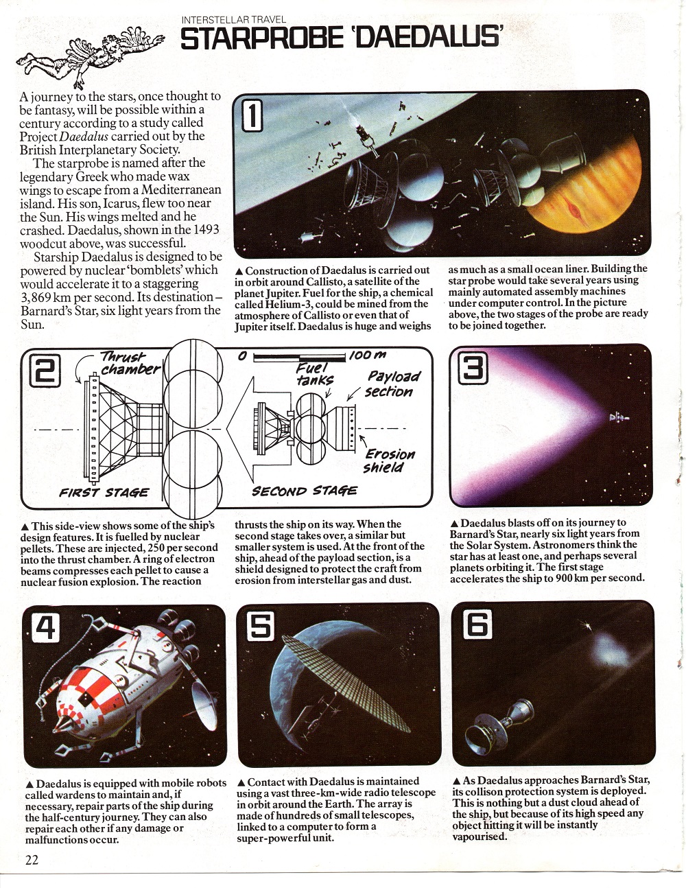
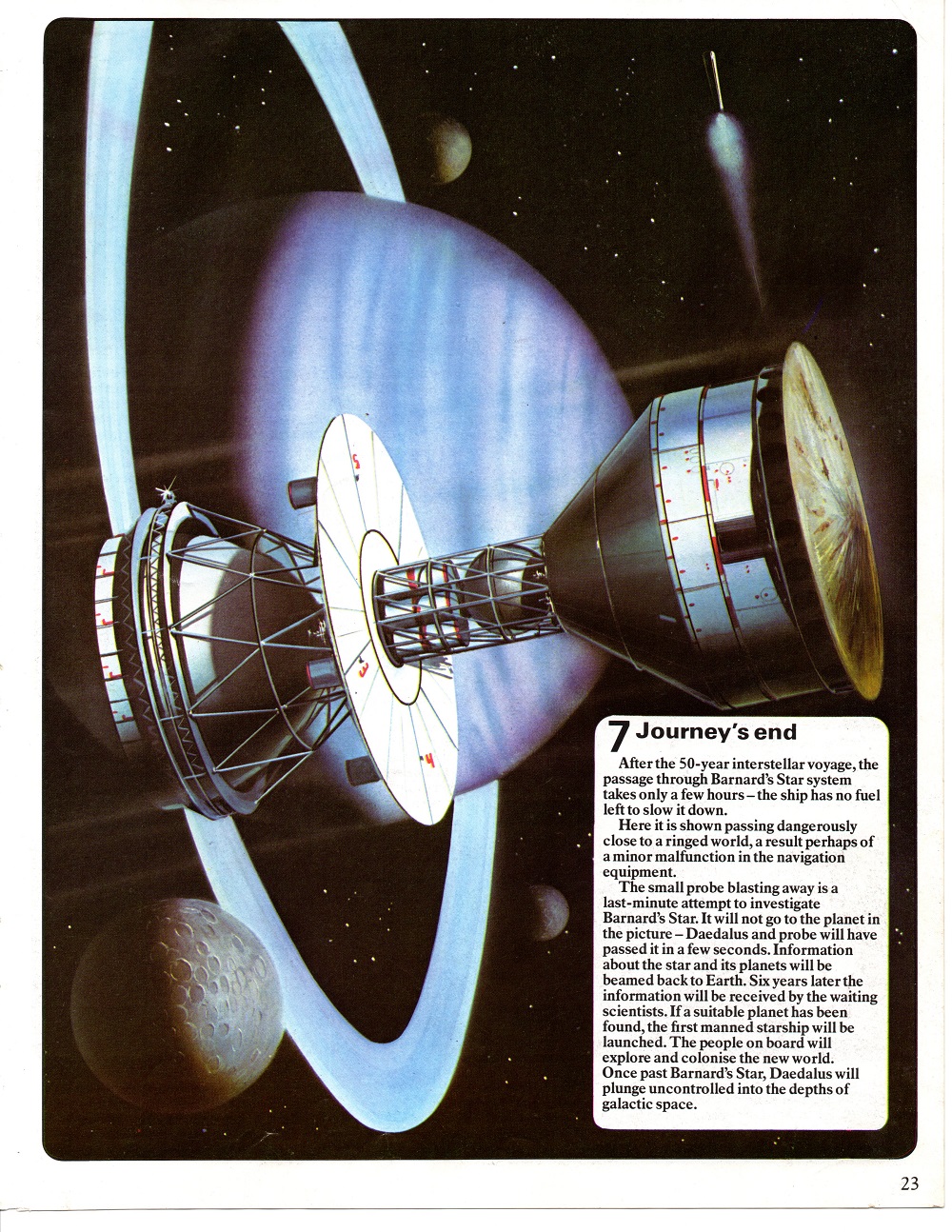
JEFFERIS: At that time, Kenneth Gatland was past-President of the British Interplanetary Society, a highly respected organisation, known for its pioneer work in outlining designs for Moon landers back in the 1950s, and for the Starship Daedalus concept in the 1970s. The BIS was a natch for technical support on the World of the Future, so I called Ken, a quietly spoken man, full of ideas and a pleasure to work with. I had worked with him on an earlier Usborne title, Young Scientist: Spaceflight, and we were both keen on this new project.

Regarding the genesis of World of the Future, I’m not sure who actually came up with the idea, Peter Usborne or myself. Either way, the series came out of a short meeting in Garrick Street, and I went away fired with enthusiasm. Was Star Wars an influence? To a degree, yes, but there were other big sci-fi movies at the time too, the most influential probably being Stanley Kubrick’s far more serious 2001: A Space Odyssey. Usborne was an educational publisher, so we had to be seen to be fact, not fiction. And of course, space was a popular subject with our principal markets: children and parents, educators and schools.

Usborne Robots

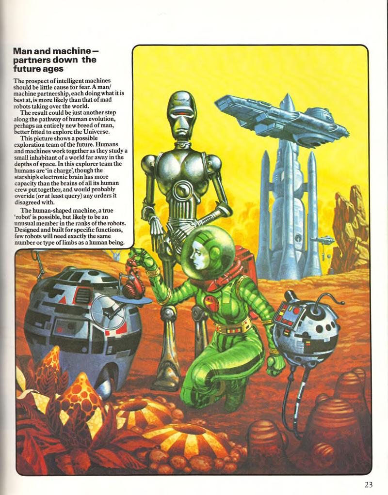
Robots and human living and exploring together, from The World of the Future: Robots, 1979

A big influence came from childhood, in the form of Frank Hampson’s Dan Dare, Pilot of the Future. The panel-by-panel presentation of the Eagle comic was similar to the Usborne educational style we had developed, and had Hampson been available for World of the Future, I would have been delighted.

Blue-sky thinking from NASA and other space organizations was huge, and Ken Gatland’s BIS connections made a huge difference to the ease of accessing photos and prints, as well as library material to which he had access. I too had a large and growing library, so between us we had call on impressive information resources. Today, my library has been mostly digitized or sold on to collectors via eBay.

Early on in the World of the Future project, Ken and I agreed on an outline flatplan—a small-scale, spread-by-spread book visualisation—which allowed each double-page spread to be effectively self-contained, though presented in a logical sequence. The three individual World of the Future titles were 32 pages each, allowing a dozen spreads to tell the story, the rest consisting of prelims and introduction, timeline and index.

I drew up detailed full-size page visuals in pen and marker, making adjustments and changes with Ken until we were both okay with the content. Once a spread was locked down, I then commissioned an illustrator to create finished art, based on my visuals. A reference pack of images, photos, books, magazines—whatever was needed—was posted off, with phone conversations on arrival, to ensure that the illustrator understood the brief properly. It’s a shame that those visuals of mine went in the bin, as they were a tremendously important part of the book creation process. But storage was a huge issue, and once finished art arrived, they were dead meat.

As a side-note, it’s worth knowing that back then, making illustrated books was a highly physical business. World of the Future was created before the Internet, or even faxes, and that meant continuous multi-way movements of hardcopy information. Reference books, clippings, sketches, notes—all had to be sent and returned by post, messenger, or rail. It was slow and expensive. In today’s money, delivery of some rigidly-packaged finished-art boards using rail and messenger bike might cost $200 USD or more, a sum that could be repeated multiple times during production. If changes were needed on a piece of art, the two-way delivery process had to be repeated. I am very pleased that no one has to waste time and money like that any more!

2W2N: Futurism these days seems much less exciting than it was when the World of the Future series debuted, revolving mostly around self-centered—and somewhat frightening, to my mind—internet and virtual reality technologies (i.e. Google Glass, Oculus Rift). What happened to exploring the universe outside of us and building bold new worlds?

JEFFERIS: I think the term ‘exciting’ depends on what you mean. The star-spanning world of the future envisaged by me and others was certainly exciting in a gee-whiz sort of way, but some of the more way-out space ideas were products of technical naivety as much as anything else. For example, the 1950s sci-fi hero Dan Dare flew spaceships like they were Spitfires, with navigation carried out with the flick of a slide-rule.

Jefferis Starcruiser c

Jefferis Starcruiser d

From 1977 to 1979, Jefferis wrote and illustrated the Starcruiser comic strip for ‘The World of Gerry Anderson’ feature in Look-In magazine.

And—bearing in mind our target audience—we deliberately left out political messages in World of the Future. But perhaps we shouldn’t have, for even then Apollo was teaching us that while political will can achieve many things, including going to the Moon, elected leaders don’t have sufficient time in power, and therefore the long-term vision needed to command vast budgets for decades at a time. Without the will, the time, the money, visionary ideas will fail. I got rather depressed about it all for a while, especially as I had drawn up in 1970 a nuclear-powered Mars ship concept, based on von Braun’s ideas. His timeline was, “…the early 1980s.”

But we are now in a better place, where I see entrepreneurs like Elon Musk and Richard Branson achieving great things by virtue of their foresight, drive, and access to finance. It’s my belief that if future spaceflight is fueled by commercial profit more than pure politics, then out into space we’ll go.

Which is not to say that organizations like NASA or ESA (European Space Agency) are redundant, far from it. Plans and intentions are as dramatic as ever, and I would certainly like to see the ‘floating buoy’ Titan probe go ahead in the not too distant future. But space agency budgets will always be at the mercy of headline-grabbing budget-cutters, so let’s just say that I heartily approve of the commercial sector flying space missions too.

Whether such blue-sky dreams as warp drive or other faster-than-light technologies will ever appear is unknown at present, but people like Miguel Alcubierre and Harold White seem to have opened the conceptual door just a crack, and with it, perhaps a gateway to new worlds—the stars our destination, to paraphrase Alfred Bester. The Lockheed Martin Skunk Works may also play a role if compact fusion lives up to its promise, with Earth-to-Mars trip times of just one month a possibility a decade from now.

Jefferis WoFuture Risto

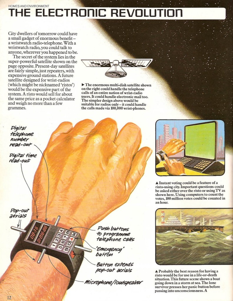
The satellite-enabled wrist-radio, or “risto,” from World of the Future: Future Cities, 1979

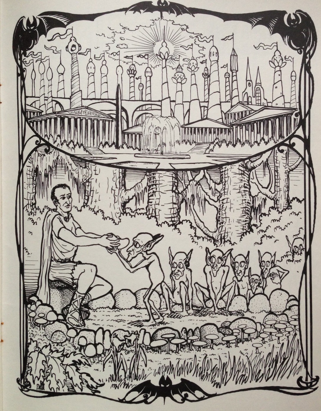
As for internet and virtual reality technologies, they are a growing part of our present future, one that was largely unforeseen, though Ken Gatland and I did our best. I’m guessing that they will blend seamlessly into our lives, in the same way that personal computers and mobile phones have done. However, I don’t see too much in internet technology that is going to change the actual nature of humanity. We are still much the same as, say, the citizens of ancient Rome, many of whom would probably fit into present-day Western culture without too many adjustments, though having machines to do their bidding instead of slaves might be hard to accept. In fact, give a time-slipped Roman some money, and a few servant-slaves would probably be installed in no time at all.

Access to the internet is on its way to becoming ubiquitous, though it’s not exactly an overnight process. I am still amazed and unamused that where I presently live, connections are frustratingly slow and patchy, and mobile phone communications even worse. Despite this, things will improve in years to come—so they tell me!

As for the future, I’m guessing that the internet is in the early stages of becoming the brainstem of a planetary AI of some sort, perhaps one in which humans function as semi-independent mobile elements. Note the ‘semi-independent’—I’m not alone in not wishing to be cut off for more than a few hours, and need my regular information fix. One thing is for sure—my various laptops have functioned as a second brain for many years.

And we previewed the Apple watch by a long way—though we called it the ‘Risto.’

2W2N: You are still active in writing, publishing, and futurism, and you’ve described yourself as a “solar evangelist.” Can you tell me more about your current projects?

Jefferis WoFuture c

Jefferis WoFuture b

Unpublished Jefferis sketches depicting (top) a high-end home equipped with gravity control, and (bottom) a concrete-and-glass Museum Building covered with bio-engineered climbing plants “designed to look good and provide a freshly-grown food supply.”

JEFFERIS: The solar evangelist tag is a direct descendent of ideas that Ken Gatland and I promoted in World of the Future, and you can see what I mean on the jacket for Future Cities. Look closely and you’ll find a solar-powered house, an idea that’s now hit the mainstream, with rooftop panels widely available to homeowners. I have been working with an excellent renewables company, and we feel we are  helping to save the planet in a commercial environment, much as SpaceX and Virgin Galactic are aiming to profit from space, or Tesla with electric cars. Incidentally, automated battery-swapping at recharge stations is an idea Ken and I pioneered, and at last something of the sort is coming to fruition.

As for solar, according to some estimates, in the United States alone, a home or business goes solar every four minutes. To put the following numbers into perspective, one gigawatt of electricity is enough to power some 750,000 homes. China smashed the record for new solar installations in 2013 by adding 11.8 gigawatts, bringing its total solar capacity to more than 20 gigawatts.

China is now second to world solar leader Germany, which is nearing the 40 gigawatt mark. On June 9, 2014, German solar supplied 23.1 gigawatts, more than half of the country’s total energy demand. So it’s an exciting time for me—reaching into the past to power the future.

Despite all that, publishing remains my first love, and my stuff ranges from books to prints.

My website www.starcruzer.com will shortly become the launch pad for ebooks, such as Ness: Hunt for the Loch Ness Monster. This is a ‘Visual Companion Edition’ of The REAL Loch Ness Monster, with a double-page visual of the monster we think lies behind the legend.

2015 titles include Space Probes, Space Stations, Black Holes, The Aces, to be published on an ebook-a-month basis on Amazon for Kindle and other e-readers. In addition, I will be establishing a presence on the micro-funding site Patreon.

Prints: I haven’t produced illustrations for book publishers in a long time, but I still draw for myself. I also love photography, probably spending more time tweaking in Photoshop than I ever did in creating airbrush art. I plan to showcase art and images on Saatchi Art in 2015.
________________________________________

As of now, you can read a compilation of all three books in The World of the Future series at the Internet Archive.

The World of the Future: Star Travel (Usborne, 1979)

Usborne Star Travel019

Usborne Star Travel-3021Usborne Star Travel-4022

Usborne Star Travel-5023

Usborne Star Travel-6024

Usborne Star Travel-7025Usborne Star Travel-8026

Usborne Star Travel-9027Usborne Star Travel-10028

Usborne Star Travel-11029

Usborne Star Travel-12030

Select pages only. Futurist and illustrator David Jefferis edited and co-wrote all of the volumes in Usborne’s influential World of the Future series (1979), which introduced a generation of kids to ideas few adults could grasp. While Star Wars had nothing of the speculative in it, Usborne and Jefferis understood that it could serve as a gateway drug into space science and more serious explorations of our interstellar future.

I was really lucky to talk to David, still very busy thinking and writing about the future, about his Usborne days and beyond. That interview will run tomorrow.

UPDATE: Mr. M.W. Schmeer has kindly notified me that the compilation of all three World of the Unknown books is online at the Internet Archive.

John Holmes’ H.P. Lovecraft Cover Art (Ballantine, 1973 – 1974)

Lovecraft Lurking Fear-2

Lovecraft Mountains

Lovecraft Shuttered Room

Lovecraft Tales Vol 1

Lovecraft Tales Vol 2

Lovecraft Tomb

John Holmes (1935 – 2011) was a British artist known for his minimalist, surrealistic book covers focusing on the human body, especially the face. The Lovecraft editions seen here—edited by August Derleth—directly succeeded Ballantine’s Adult Fantasy editions, which were edited by Lin Carter with covers by Gervasio Gallardo. The first printing of the Derleth/Holmes editions shows the titles in white lettering and volumes were priced at 95¢/apiece. The second printing, at $1.50/apiece, matches the much more engaging title design with the color of Holmes’ respective faces, with HPL’s name in bold yellow.

As an aside: as much as I like Holmes’ work in the fantasy and sci-fi genres, my favorite work of his is the 1969 Panther edition of Vladimir Nabokov’s Despair. The novel is about a Russian businessman who believes a vagabond he meets in Prague is his doppelganger. He murders the man in pursuit of the perfect crime, but it turns out the man actually looks nothing like him, and the police quickly catch the imperfect criminal. The cover painting is a slippery, postmodern homage to Edvard Munch’s The Scream (1893).

Nabokov Despair 1969

Cthulhu Calling: An Interview with Byron Craft

BC-1

At one point in the late 1970s, after almost two decades of middling adaptations, H.P. Lovecraft fans were very close to getting a movie worthy of their devotion. The Cry of Cthulhu was written and co-produced by a young cosmic horror adept named Byron Craft. It promised to be the first Lovecraft adaptation to directly—and faithfully—address the Cthulhu Mythos, and a number of future special effects superstars were slated to work on the picture, including Tom Sullivan (The Evil Dead), Ernie Farino (The Terminator, The Thing), Lyle Conway (The Dark Crystal), and Craig Reardon (Poltergeist). Ultimately, Hollywood machinations quashed the much anticipated project, but, as the mad poet said, “that is not dead which can eternal lie…”

The Alchemist’s Notebook, Byron Craft’s novelization of his original screenplay for The Cry of Cthulhu, was released in early 2014. I had a chance to ask Byron a few questions about his book, the enduring appeal of Lovecraft, and the history behind The Cry of Cthulhu.

Read more about Byron and his works at Byron Craft Books. You can purchase a paperback or Kindle copy of The Alchemist’s Notebook at Amazon.

  * * *

BC-2

* * *

2W2N: How and when did you first discover the works of H.P. Lovecraft?

CRAFT: I was twenty-two and attending college, in the latter half of 1968, when a good friend of mine, Bob Skotak, got me started reading Lovecraft. If my memory serves me correctly, the first of Lovecraft’s works I read was “The Colour Out of Space.” It was one of Bob’s Favorites. I couldn’t put it down, and within a six month period I devoured everything HPL wrote, including a collection of his letters. I am still obsessed (or is it possessed?) to this day.

2W2N: Lovecraft experienced quite a resurgence in the 1960s. Why do you think that was? What drew you personally to his work?

CRAFT: The 1960s resurgence of H.P. Lovecraft and the writer aficionados who followed him was owing to several reasons. It was the era of the Vietnam War, an emerging drug culture and a revolution against the then government establishment. It was the age of the anti-hero. One of the remarkable things about Lovecraft’s stories is that his protagonists were rarely handsome men of action; as readers of that period we preferred to follow his scholars and amateur investigators as they pursued the winding road of mystery, uncovering ancient secrets that sometimes led to insanity.

The dreams, the drugs, the witchcraft and the wormholes all played well to the “Turn on, tune in, and drop out” crowd. The desire to expand the consciousness welcomed the aliens and their alarming deities to the mundane world where the deviation from the normal was embraced. All of this oozed from the pen of one of the most influential sci-fi fantasy and horror writers of the 20th century—H.P. Lovecraft.

Lovecraft Dunwich 1963

First Lancer Books edition, 1963. Cover art by Len Goldberg.

Lovecraft Dunwich 1971

Third Lancer Books edition, 1971. Cover artist uncredited.

Fandom also grew in the 1960s during the “Monster Boom,” which was bred from the revival of the Universal monsters and merchandise, including publications like Famous Monsters of Filmland. Plus, August Derleth’s Arkham House publishing house was going strong back then with its hardcover reprints of Lovecraft’s stories. Ballantine Books picked up the rights from Arkham House to do paperback editions of the same, thus bringing Lovecraft very close to mainstream status, primarily with the youth of the hippie movement.

Having discovered the stories of Lovecraft when in my twenties, I immersed myself in every one of his works. Later, I explored those who continued the Cthulhu Mythos, as well as the authors to whom Lovecraft thought of as contemporaries, such as Lord Dunsany, Robert E. Howard and Clark Ashton Smith. To this day H.P. Lovecraft holds a strange attraction for me. He was the creator of Arkham, Innsmouth and Cthulhu; and he was the quintessential outsider who believed that human laws, interests and emotions have no validity or significance in the vast cosmos.

2W2N: When did you write (as David Hurd) the original The Cry of Cthulhu script, and when did you start shopping it to the studios?

CRAFT: Bob Skotak and his brother Dennis and I produced an independent film titled Timespace that never got past the rough cut. I also worked with them on some amateur film projects. Bob and Dennis relocated to the west coast sometime in the mid ’70s. I wrote The Cry of Cthulhu screenplay, final draft, in 1976. In 1977 I hooked up with Bill Baetz and we became the co-producers of the project. Bill had several connections in Hollywood by way of his uncle Jerry Logue. Jerry was a retired VP from United Artists and a grand gentleman. Mr. Logue set up several appointments for us with a variety of studios over the next few years to pitch our story. Around that time was when Bill Baetz introduced me to Tom Sullivan and Tom did several awesome pieces of artwork for Cry. We used Tom’s works in our presentations. We had color 35mm slides of Tom’s paintings and in the days before PowerPoint we would put on slide shows for various studio executives.

2W2N: Was the late Dino De Laurentiis one of the executives interested in your script?

CRAFT: I believe it was the summer of 1978 that Bill Baetz and I met Dino De Laurentiis. It was during that time that we were carrying on several correspondences with Arkham House’s attorney and April Derleth Jacobs, the daughter of August Derleth. We sent them a copy of The Cry of Cthulhu screenplay and asked for permission to make a film in the style of H.P. Lovecraft. We legally did not have to get their permission because Lovecraft never copyrighted any of his works and, as many of his fans know, he encouraged other writers to carry on with the Cthulhu Mythos. All the same, Bill and I believed that a friendly working relationship with Arkham would be best in the long run. The results were favorable and we carried on an amiable association with Arkham House.

Both Arkham’s attorney and Ms. Jacobs told us that they were very disappointed with the Lovecraft films that had been made up to that point and that they had been contacted by Dino De Laurentiis.  Mr. De Laurentiis, according to them, was interested in acquiring the rights to one of H.P. Lovecraft’s stories. As the account was related to us, they were familiar with Dino’s track record (i.e. King Kong 1976) and they refused to do business with him.

BC-5

BC-4

Tom Sullivan concept art for The Cry of Cthulhu, 1978

Later, our agent Jerry Logue was contacted by Dino De Laurentiis’ office and told that Mr. De Laurentiis was interested in financing our film project. After our communications with Arkham House we were very leery. We sent word back that we were not interested in selling the project to Mr. De Laurentiis. A very short while later we were contacted by his office and told that Mr. De Laurentiis wanted to finance the project, that he would not be involved in the production of the film and would get the credit of executive producer. We knew that he had made similar arrangements in the past, so we flew to the west coast to meet the great Dino De Laurentiis.

When we walked into his office it became a horse of a different color. There was no film production investment made in heaven. Instead, he acted like his office never proposed a co-production deal. He offered us $100,000 for the complete rights to The Cry of Cthulhu. We would have no hand in making the film, we would not have any additional piece of the action and we would lose all ownership of the project including sequels, prequels, spin-offs, novelizations and product endorsements.

We refused the offer. It was immediately evident to us that he was unwilling to discuss any other alternative and we started to leave. De Laurentiis left his chair and with clenched fists started jumping up and down, screaming and yelling, “I don’t need you!  I will make my own Lovecraft movie.” Normally, I don’t put up with anyone’s nonsense, but I was temporarily in shock to see a grown man behave in such a way. My partner Bill was more audacious then me that day and said, “No you won’t. We talked with Arkham House and they refused to sell you the rights to any of Lovecraft’s stories.” Dino got really fired up after that and I was afraid that he would spontaneously combust. I guess he never knew that ole’ HPL’s work was public domain. We left in a hurry and it was the last time either one of us saw Dino De Laurentiis.

2W2N: Was a director ever attached to The Cry of Cthulhu? If so, did you have conversations with him or her?

CRAFT: The director that Bill and I had signed under a conditional contract (conditional upon The Cry of Cthulhu being produced) was Wolfgang Glattes. We had several conversations with Wolf and we also met with him in my home. Mr. Glattes was particularly interested in approaching the portion of the film from the female protagonist’s point of view.

2W2N: Can you tell me why the film never got made?

CRAFT: We simply ran out of money and patience. We both had families that needed us more than the film project. So we shelved it and went on with our lives.

2W2N: When did you decide to adapt your The Cry of Cthulhu script into novel form, and how did you find the experience? Adaptations usually go the other way around.

CRAFT: It was something we would discuss, from time to time, during the pre-production and pitching of the film. It was only talked about and I had nothing on paper besides a few scribbled notes and my screenplay to use as an outline. I always wanted to approach the novelization of the screenplay with a slightly uncommon style. I wanted to tell the story from three different people’s points of view. I always wanted to do it as three separate narratives wherein, as one leaves off, the other begins, seamlessly weaving the entire story together.

Part One is titled “The Schloss,” which was taken from the diary of Janet Church. Part Two became “The Alchemist’s Notebook,” which was from the journal of Heinrich Todesfall, followed by Part Three, “The Cry of Cthulhu,” which was written by Faren Church, the male protagonist of our tale.

BC-6

BC-7

In 1979 Bill Baetz was contacted by Heavy Metal magazine. They wanted to print an excerpt from the novelization of The Cry of Cthulhu for their special October/Halloween/Lovecraft issue. Bill committed us and I was forced to perform. Rather than approaching the story from beginning to end, like any sensible earthling would do, I decided to start in the middle. I made the decision to write Heinrich Todesfall’s narrative first. Todesfall was an aging Nazi with a mind that had been warped and twisted by a world war. Becoming a master sorcerer, he searched the world for arcane secrets that he would eventually use for his own selfish and destructive end.

The Todesfall portion of the novel, for me, was easy as well as fun to write. It also contained an element within the structure of the story that made it a stand-alone read. It was a perfect pick for Heavy Metal’s October issue. My only regret is that the piece was hurried and was truly a rough draft. I apologize to the readers of that decade for a rushed job. If you are kind enough to pick up a copy of my novel, The Alchemist’s Notebook, you will find that the ravings of the megalomaniac Todesfall are done in a more polished and mature style.

As it turned out, years later, when I completed the first draft of the entire novel, my expectations as an author had reversed. Having Todesfall’s story primarily behind me, I was very apprehensive about writing Janet Church’s narrative. I figured that when it came to writing the husband’s account it would be a piece of cake. All I had to do was write it as if I was the one experiencing the terrors… right? But writing a portion of the novel from a woman’s perspective was daunting. Facing up to the challenge, I began writing Janet’s story next and at once discovered that when I got her narrative started I couldn’t shut the old girl up. It was just the opposite with Faren. Writing his narrative was a very difficult and arduous task. Nevertheless, as the old adage is recited, “If it isn’t hard it isn’t worthwhile,” and Faren’s chronicle eventually became a labor of love for me. I was able to dig down into the depths of Church’s soul. We have become close friends ever since.

I hope that whoever picks up The Alchemist’s Notebook will enjoy reading it as much as I enjoyed writing it.

BC-3

2W2N: Much of Tom Sullivan’s original concept art for The Cry of Cthulhu was used to illustrate The Alchemist’s Notebook. How did that come about?

CRAFT: The final edit of my novel The Alchemist’s Notebook was completed around April of 2013. I always wanted to use Tom Sullivan’s painting of Faren Church (the male protagonist of the story) digging up his great Uncle’s coffin. It is a frightfully good rendition of what happens in The Cry of Cthulhu, with his uncle’s screaming, rotting corpse rearing up out of the grave and the demon Yath-Notep rising up in the background. The problem was that Tom and I had gone our separate ways and we hadn’t communicated in 35 years.

It was Google to the rescue. I just did a simple search for “the Artist Tom Sullivan” and voilà, there was his website. I went to Tom’s contact page and the next day we were reminiscing on the phone.  Originally we made a deal for the use of the painting as the book cover alone. About a week later I was kicking myself for being stupid because Tom had originally done eleven paintings and illustrations for the film project, and I should have attempted to include them in the book as well. We amiably renegotiated a new deal, and The Alchemist’s Notebook ended up with a dynamite cover and fantastic interior illustrations. I have probably received an equal amount of complements for the artwork as I have had for the novel itself.

2W2N: What’s next for you? Can we look forward to more Lovecraft-inspired novels?

CRAFT: I have been writing reviews and historical articles for Strip Las Vegas magazine for going on ten years (over a hundred articles), but I do have quite a bit coming up in the fiction market, all Lovecraftian. I have a short story soon to be available on Kindle titled “Pilot Demons.” A friend of mine is after me to change the title to “Cthulhu’s Minions.” He may win that battle. If you have read The Alchemist’s Notebook, you will be familiar with the little revolting creatures. One of the main characters in the book describes them as “ethereal puffs of smoke that sometimes take shape and solidify.” Like the pilot fish of a whale they wait in subterranean depths to guide their master into our world. The short story takes place in Arkham and my main character is “the detective with no name” who is saddled with a case of serial killings that appear to have been done by hideous dwarfs.

BC-8

Walt Simonson’s illustration for the Heavy Metal adaptation of The Alchemist’s Notebook

I am currently working on my next Lovecraftian novel. It seems of late that I am having difficulties naming my works because I really wanted to call my next book “Tunnels,” but I’ve recently learned that there are several books on the market with the same title. I have re-titled it, but for the time being it is a secret. The story is about a group of scientists and military personnel who discover a network of tunnels beneath the Mojave Desert. They soon learn that the tunnels were constructed millions of years ago by an unknown race. They also realize, to their horror, that something still lives in the ancient passageways.

I refer to these works as “THE ALCHEMIST’S NOTEBOOK PROJECT” because it will be a series of five Cthulhu Mythos novels dealing with mankind’s internal, as well as outward struggle to control their own destiny while encountering malicious beings from another time and space.

___________________________________

All of the Tom Sullivan artwork included in this article—and more—appears in The Alchemist’s Notebook and is © Tom Sullivan.

You can see more of the October 1979 issue of Heavy Metal magazine at John Coulthart’s website and The Por Por Books Blog.

The Starlog #24 (July, 1979) feature on The Cry of Cthulhu is posted here.


Pages

Archives

Categories

Donate Button

Join 1,118 other subscribers