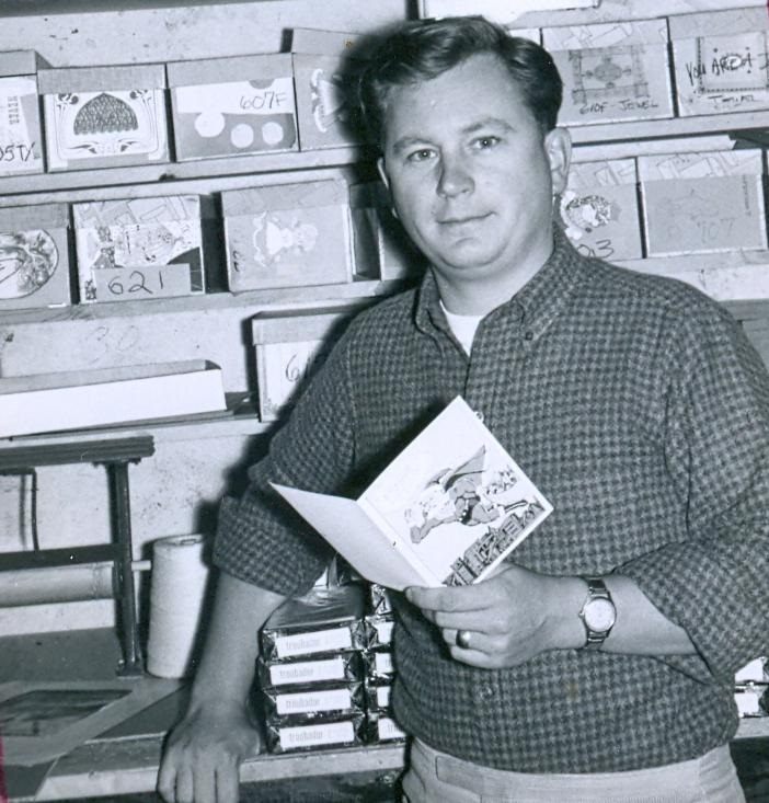
Malcolm Whyte making greeting cards, 1966.
When Malcolm Whyte published the first Troubador title in 1967, he did more than revolutionize the coloring and activity book format. Like George Lucas, Gary Gygax, and Nolan Bushnell would do years later, he paid young people (and the young at heart) the respect of treating their offbeat interests and ideas with importance. All the things we dreamed about—spaceships and robots, barbarians and sorcerers, magical creatures and famous monsters, dinosaurs and lost worlds—came to life, year after year, in spectacular new ways.
Troubador books stood out. They were beautifully designed and crafted, bigger (the publishing term is “oversized”) and much sturdier than traditional coloring books, with thick pages that could be safely detached. The illustrations were lavish and accomplished, and they were often accompanied by verses, or lively synopses of ancient myths and famous books, or instructions on how to build your UFO after you colored it.
Whyte, deeply influenced by twentieth century graphic art, particularly the underground comix of the late ’60s, hired many brilliant artists, emerging and established, ingeniously matching their unique styles to one or more of his lofty subjects. In retrospect, Troubador Press acted as a kind of conduit through which kids of the ’70s and ’80s were exposed to the styles and attitudes of the ’60s. It turned out that both “hippies” and “geeks” shared a kinship with all things fantastic, epic, idealistic, intellectual, and iconoclastic.
For those of you interested in owning a piece of American publishing history, Malcolm has a very limited number (2 to 3, at most) of uncirculated file copies of most Troubador titles (you’ll find a nearly complete bibliography at Cornell University Library). Please email Malcolm (wordplay@worldpassage.net) with the name or names of the books you’re interested in, let him know who you are and how you found him, and he will give you a quote.
* * *
2W2N: How did you get into publishing?
WHYTE: Troubador Press started with a partnership between two ex-Naval officers—Brayton Harris and me—who first started a greeting card printing business under that name in the late 1950s. Brady returned to the Navy in 1961 to eventually finish out his career there at a full captain. I carried the line on until incorporating the Press in 1970. The first book was The Fat Cat Coloring & Limerick Book, 1967. It was illustrated by Donna Sloan, expanded from a number of designs she did for Troubador’s greeting card line.
The greeting cards weren’t doing very well by the end of 1966 (especially considering the competition: Hallmark, American Greeting, Norcross, etc.), and I needed something new to get sales back up. I had enlarged one of Donna’s designs with the idea of making colored plaques to decorate kids’ rooms, the den, etc. My Northern California sales rep saw the big cat and said, “That’d make a great coloring book!” I said, “No way. Coloring books are passé.” However, there was a large Mandala coloring book done on sturdy paper at the time, and some other design coloring books sold by Price Stern Sloan, that were not the usual kid’s fare, and I needed something.
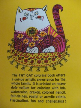
So, I made a 32-page dummy with more of Donna’s art and took it to the post office. I wanted to see if it could be shipped at book rate. This was (and still is) much cheaper than regular package post, at which the greeting cards were shipped, so the books offered a price advantage to a buyer. Would Fat Cat ship as a book? The postal director took the dummy, counted the pages and handed it back. “Well, you’ve got a front cover, a title page, copyright page, 15 full-page drawings and a back cover. That’s 19 pages. You need 24 pages with printed matter on them to go book rate.”
I said: “You mean if I put something on these other pages, opposite the drawings, I’d have 32 pages and it could ship as a book?” “That’ll do it,” he agreed. Great! I hustled back to the shop (still doing lots of printing), wrote 15 limericks to go with the drawings, handset the lines, and printed the first 5000 copies of Fat Cat. It seemed to fit right into the hip aesthetic of the time. I never considered the designs “psychedelic,” but others did, evidently. Anyway, they sold fast, and I made more. The next year I followed with The Love Bug Coloring and Limerick Book (1968) with more of Donna’s designs and my verses. There were now two books in the Troubador line, and by 1968 I was in the book publishing business.
2W2N: Troubador books are tremendously unique, almost eccentric. I remember walking into bookstores in the late ’70s and instantly picking them out of the stacks, and this is before a publisher’s name meant anything to me. The illustrations were elaborate and exciting, not flat and dull like other coloring books. The writing was smart. And the books covered everything from wildlife to the zodiac to spaceships and monsters. How did the direction of the line develop?
WHYTE: The direction of Troubador books developed through a combination of form and content.
I was impressed with the heavy paper used in the Mandala Coloring Book, and chose to use it too. Actually, Troubador used the same stock on which we printed our greeting cards: #67 vellum, the same as authorized by the U.S. Postal Service for post cards. Its sturdiness allowed for coloring with almost any medium, especially the inexpensive felt-tip markers that emerged at the same time as Fat Cat, without the color coming through the other side (if not applied too lavishly). The large size allowed for detailed artwork without crowding the page. Illustrations were printed on only one side of a page so that they could be removed from the book and displayed by the diligent colorer and proud parent or teacher. Well, not a teacher: more about that later.
The expedience of adding verses to Fat Cat inadvertently made Troubador the initiator of significant text in coloring books. Librarians and teachers, especially art teachers, thought coloring books were an abomination, and I agreed, but only if coloring books were the beginning and end of a child’s art experience, and if children were never taken to art museums or galleries or shown colorful art books, etc. To counter this resistance, Troubador books needed more educational content (even though I felt that the verses in Fat Cat and Love Bug offered some good easy reading). Our third book, Ruth Heller‘s Color & Puzzle (1968), swung the door wide open. It’s large 12″ x 12″ format of crisply designed mazes, puzzles, and word searches created colorful mini-posters that teachers used as collateral material in their math lessons. They couldn’t get enough of them, and Troubador books obligingly expanded their educational tone.
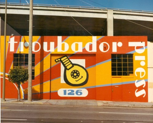
Troubador building at 126 Folsom Street, San Francisco. Supergraphics painted circa 1971-1972 by Gompers Saijo. (Photo: Malcolm Whyte)
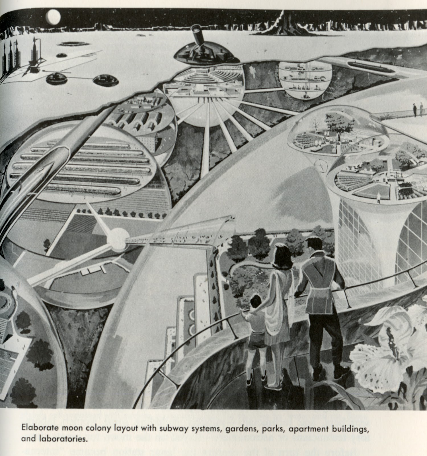
As publisher, it was my joy and responsibility to select all the books that we published. I generated the idea for most of them based on (1) what was currently “out there”: ecology, “save the whales,” “what’s your sign?,” and, in the case of Dungeons & Dragons, what my kids were into; and (2) what interested me as a kid: wildlife, dinosaurs, pets, American Indians, and science concepts like 3-D views, optical illusions, and animation. We published books that were submitted to us, too. The Dinosaur Coloring Book (1970), 3-D Mazes (1976), and Paper Movie Machines (1975) were hugely successful.
All these elements added to the cost of making the book, of course. Selling a $2 coloring book in a 39-cent market at the time was a battle, but it worked.
2W2N: I’m glad you brought up the Dungeons & Dragons Coloring Album. Can you tell me more about how it came about? Did you speak with Gary Gygax about the concept and layout of the book? And what are your memories of illustrator Greg Irons, who passed away a few years after it was published?
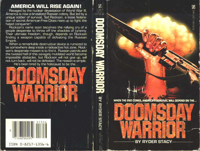
WHYTE: Troubador published The Official Advanced Dungeons & Dragons Coloring Album (1979) on the heels of its first licensing venture, Gorey Games, by Larry Evans with art by Edward Gorey.
My youngest son, Andrew, had been playing D&D for a couple of years with his friends. When I suggested to the owner of our favorite local toy store that I might do a coloring book based on the game, he shouted, “You’ve got to do it!” I’m usually uncomfortable making “cold calls,” but when I found out the inventor, Gary Gygax, lived in Wisconsin, I felt a little more at ease: I was from Wisconsin, so we had that in common. I pitched the book idea to Gygax, suggesting that we’d get the game into markets he didn’t already have, namely gift and book stores. That made sense to him. He agreed not only to license his concept to Troubador and write profiles of each of the creatures in the book, but he even invented a unique game for it. We had to call the book The Official Advanced Dungeons & Dragons Coloring Album because Gygax was having a dispute with a partner about who owned what, but Gygax owned the exclusive right and title to the “Advanced” format.
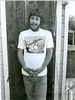
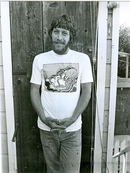
Greg Irons, circa 1982. (Photo: Clay Geerdes)
I admired Greg Irons’ art that he did for the underground comix. He had a strong sense of composition and was great with monsters. He enthusiastically agreed to illustrate AD&D. Greg was not only a thoroughly professional artist (he spent a couple of years in London working on the Beatles’ Yellow Submarine feature), but an easygoing, sweet man. His powerful visualizations of the AD&D monsters and their world really brought them to life. Larry Evans, who was art director for Troubador, worked with Greg on the book, pointing out Greg’s subtle sense of humor by noting: “he’s the only person I know who has a tattoo that says ‘tattoo’ on his arm.” He was a glorious guy.
It was a lucky hunch to publish AD&D. Shortly after its release a Michigan State student mysteriously disappeared. The only clues to his whereabouts were some odd symbols scratched on a classroom blackboard—symbols particular to the D&D game. The cryptic clues were all the news media need to flash the story—and the game—from coast to coast. The student reappeared a few days after vanishing, and headlines turned elsewhere—but not before putting the game on the map and helping to make a super seller for Troubador.
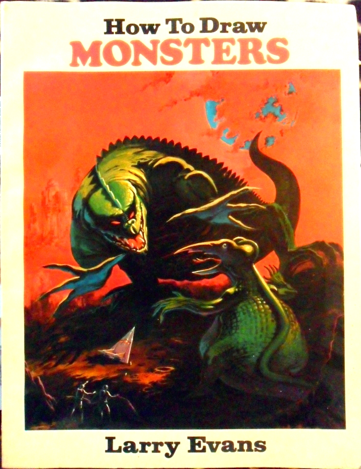
2W2N: The AD&D book wasn’t Troubador’s first foray into fantasy. I was mesmerized by Tales of Fantasy (1975), and refused to color it because I didn’t want to sully Larry Todd‘s illustrations. You seem to have anticipated the potential of the genre before D&D and the animated The Hobbit and The Lord of the Rings features made it so popular. Another of my favorites is How to Draw Monsters (1977), by the brilliant Larry Evans. Was the book inspired at all by Berni Wrightson’s The Monsters: Color-the-Creature Book from 1974? And how did you meet Larry?

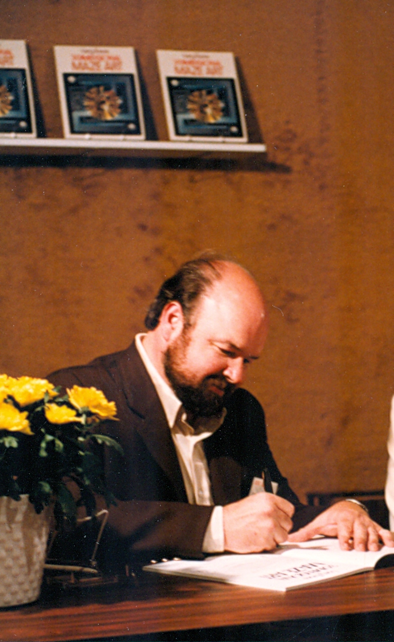
Larry Evans at the National Book Convention, Los Angeles, 1982. (Photo: Malcolm Whyte)
WHYTE: In spring 1974 Larry Evans called on us with his portfolio of stunning 3-D mazes—he had seen Troubador books in many stores at the time. Troubador already had three fast-selling Maze Craze books, so adding a 3-D twist was irresistible. Besides his wonderful mazes, Larry had great credentials: he trained at the Art Students League in Pasadena and was rendering projects for major architects. With dashing beard and mustache and barrel chest, he cut an impressive figure that stood six feet tall and could bench press 240 pounds!
I lusted for those mazes, but a couple of things gave me pause. His art was so good, I was afraid we couldn’t afford to publish it, and his confident, self-possessed demeanor made me think that he might be hard to work with. So, I said as we moved toward the door, “Larry, these mazes are terrific. Your work is excellent, but you’re just too good for us. Thank you for stopping by.” And off he went looking both proud and perplexed. For the next year and a half he went to other publishers with his drawings. In spring 1975 Larry called back to make publishing his work easy for Troubador. Larry Evans’ 3-Dimensional Mazes was launched in spring 1976, and was joined by his 3-Dimensional Monster Mazes in fall of 1976.
Troubador published its first monster book, Monster Gallery, in 1973. Written by Leah Waskey, Troubador’s bookkeeper, and drawn by Mark Savee, it was a big hit. Science Fiction Anthology quickly followed in 1974 with Savee’s robust art and text by his father, Ken Savee. Underground cartoonist Larry Todd completed our “monster coloring book trilogy” with Tales of Fantasy in 1975. Obviously this genre was working well, so I asked Evans if he could make a How to Draw Monsters book. Of course, he could do anything, and the book came out in 1977, unaware of Berni Wrightson’s coloring book.
I had a grand time working with Evans after all. He was a great friend and collaborator, who created 20 books for Troubador.
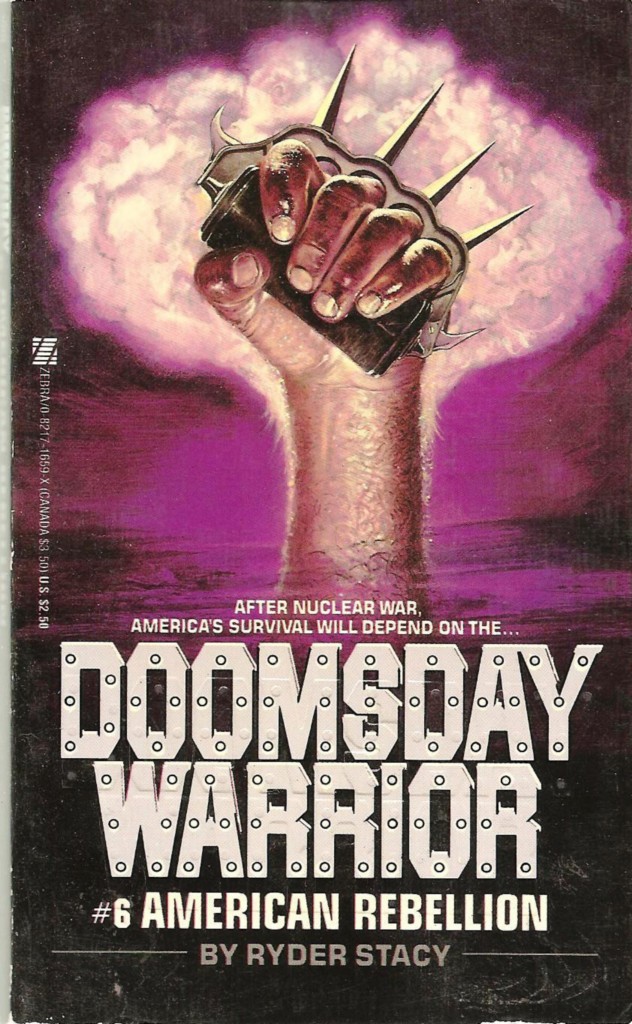
2W2N: I have to know about 1971’s The Occult Coloring Book. The writer, Richard Garvin, had written a few novels at that point, I believe. He also went on to write a fairly popular book called The Crystal Skull (1973), about the possible occult origins and powers of a quartz skull discovered in 1924. (This artifact was the inspiration for Indiana Jones and the Kingdom of the Crystal Skull.) Gompers Saijo, another wildly talented artist, illustrated the book. How did the project come about, and did you have any problems getting the book into stores?

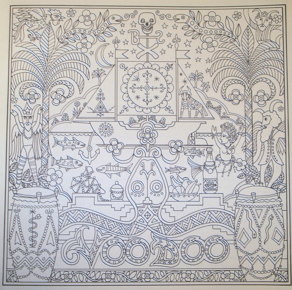
A page from The Occult Coloring Book (1971). Art by Gompers Saijo.
WHYTE: The Occult Coloring Book followed after the continuing interest in all things zodiac (in addition to our Zodiac Coloring Book, we had a Zodiac Cookbook and a Zodiac Sign-In Book, an autograph book for friends and celebrities to sign under their sign). I had known Dick from his working at a local bookstore that sold our books. I believe he suggested we should do an occult book. I agreed and put a call into Art Jobs Agency, run by Dora Williams, for an artist. She suggested Gompers Saijo. He turned out to be a perfect partner for Dick. It wasn’t too long after that that Garvin’s The Crystal Skull was published.
The only problem we had selling the book was its size: I loved the 12″ x 12″ mini-poster size that was initiated with Ruth Heller’s Color and Puzzle, but it was awkward for stores to display. Some stores did think it was kind of spooky and resisted buying it: they found it a bit odd coming from the same publisher as the cute Fat Cat books.
I was so taken with Gompers art—and his story—that I asked him to illustrate our North American Wildlife (1972) book, then North American Birdlife (1972), then North American Sea Life (1973), Jungle (1975), etc. Gompers’ father was a strong labor supporter. He admired Samuel Gompers so much that he named his son after the labor leader. As a child, Gompers was sent to an internment camp with his family during WWII. He eventually settled in San Francisco as a very successful product designer. His supergraphics for our first building is a result of his design sense on a great scale.
2W2N: You were an independent (“indie”) publisher before that definition really came into popular use. Can you tell me about the process of marketing and selling a book before the big bookstore chains transformed the nature of the business? How long did it take to get a book into the stores once it was complete? Was Troubador West Coast only?
WHYTE: Troubador’s book distribution grew out of its already established sales through gift reps; that is, sales reps who called on gift stores to take orders for our greeting cards. So we got our first book in the stores right away. In fact, Fat Cat was so successful that it eclipsed the greeting card sales, and showed me which direction to turn the business. Some of our best orders came from National Wildlife Federation (Ranger Rick magazine), science museums, aerospace centers, and (ironically) teacher stores.
With Fat Cat we added our first book rep, then more reps, as the book line grew (the company was about 15 in the office and warehouse, including me). We added toy reps at the same time, so eventually we had three teams of reps calling on stores—and most of them were independent stores—all over the country. We were strongest on the West Coast and East Coast, then the Midwest. The South was always a challenge. We sold to the chains, especially B. Dalton, at the time, but finally cut them off after they kept returning books from the same store that was ordering them! Central buying was poorly managed.
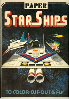
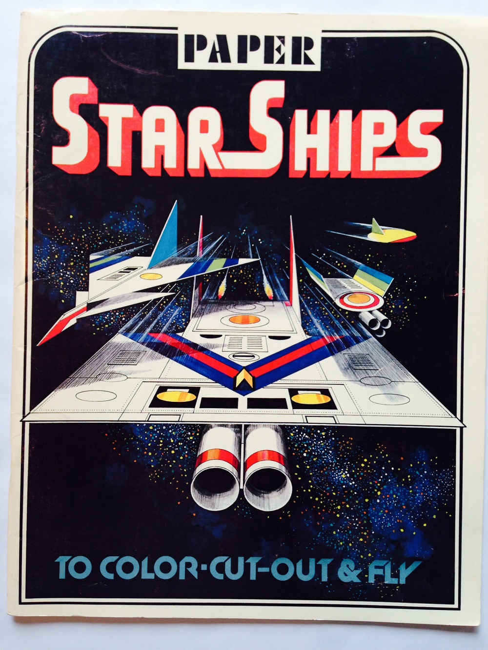
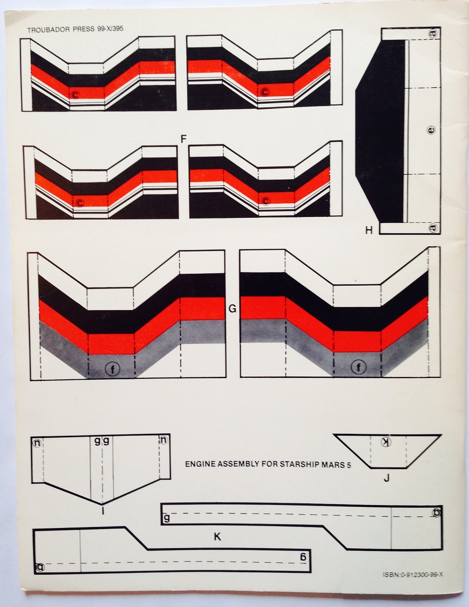
2W2N: Troubador put out a number of books focusing on spaceships and robots in the late 1970s, including Paper Starships (to Color, Cut-Out and Fly) (1979), Space WARP (Warrior Activated Robot Patrol) (1978), and How to Draw Robots and Spaceships (1982). Was this a direct response to the popularity of Star Wars? What do you remember about Space WARP (1978) in particular, another stellar Larry Evans design?
WHYTE: The robot/spaceship books of the late ’70s were indeed a response to the great success of Star Wars, Star Trek (TV & movies), Battlestar Galactica, etc., but were also launched with the on-going success behind them of our best-selling Paper Airplanes book (1974), with dazzling Art Deco designs by Marc Arceneaux. We were fortunate to find a charming Korean artist, Yoong Bae, to create the many flying models. Asked if the robots would actually fly, he’d say with a twinkle: “They make good fry.”
Since the late 1960s, I had been collecting Japanese anime die-cast figures—Kamen Rider, Kikaider, Raideen, etc.—for their unique design: colorful, exotic, I’d never seen anything like these fabulous inventions. Working with Larry Evans—and it was great fun brainstorming ideas with him—during the space movie/TV phenom, I said we should do something that reflected these Japanese toys. Before I could say “Take us out, Mr. Sulu,” he came up with the outline and the art for Space WARP. The actual story was written by Frank Fox, of American Indian descent, who had recently written the text for Troubador’s North American Indians (1978). Larry’s concept for Baron Zax, with reference to old comics’ Iron Jaw, the beautiful lady, Charmion, and the faith(less/ful) pet dog, Kurr, are all a hoot. Also, his schematic of Space WARP’s interior is an absolute prize! I miss Larry: his brilliance, his chortle, his companionship.
2W2N: You sold Troubador in 1982, is that right? If so, what happened?
WHYTE: I sold Troubador to Price Stern Sloan of Los Angeles in 1982 and stayed on as Editorial Director until 1996. I produced four books a year for PSS and they published those books. Somewhere near the end of that term, PSS was bought by Grosett Publishing, which in turn merged with the Putnam-Berkeley-Penguin Group. Troubador then began an around the world tour. In 1994 Penguin-Putnam was bought by MCA/Universal (film), which was owned by the Japanese conglomerate Matsushita, which later sold MCA to Seagrams, the Canadian booze company, which unloaded the whole book business on Pearson, publishing giant of Great Britain. Troubador is now part of PSS, an imprint of Penguin-Putnam, owned by Pearson—although I don’t think Troubador books (or the Troubador name) are currently active.
In the middle of all this, 1984, I founded the Cartoon Art Museum in San Francisco with several other cartoon art collectors.
2W2N: Have you ever thought about reissuing a selection of the original Troubador books? Is that even possible, business-wise? Many of us who grew up treasuring the line have kids of our own now. I sure would like to introduce my daughter to those experiences.
WHYTE: It would be great if someone brought some of the old titles back. I never wanted to get back into such mass publishing again: that’s why I started the Cottage Classics line: publish one book at a time, sell it out, and publish the next one—all short run, under 2000 copies. No inventory, no warehouse, no staff. That all worked out very nicely.
When I sold Troubador all rights that Troubador owned went to PSS: about 50% of the books I published I bought as “work for hire”; that is, I bought the rights to the art and/or text. Those rights that the authors and artists owned still belong to them, but only if they renewed their copyrights (in those days rights were good for 54 years: 27 years, then 27 years more if re-registered.)
Actually, I did obtain the copyright to the Fat Cat/Love Bug books and tried to resell them to a publisher, but they were declared “dated” even though I had cleaned up the art a bit. Also, coloring books seemed to have vanished from the independent book and toy store shelves—along with the stores themselves. Now kids can do coloring on their computers, mobiles, tablets, etc.
No new Troubador books have been released by PSS since the late 1990s, and those that were good sellers finally went out of print about 7 or 8 years ago.
2W2N: Tell me more about Word Play Publications. You started the company in 1994?
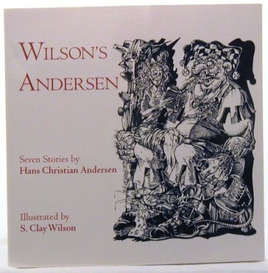
WHYTE: After I sold Troubador to PSS, I reincorporated as Word Play in 1982, still making books for Troubador/PSS, but also operating as an independent editor and publisher. After creative work wound down at Troubador/PSS and the Cartoon Art Museum was running fairly steady with a director and staff, I sorely missed active book publishing, so I embarked on producing very limited edition books.
The first Word Play book, published in 1994 under the Cottage Classics imprint, was Wilson’s Andersen, seven Hans Christian Andersen tales illustrated by underground cartoonist S. Clay Wilson. The idea of having one of ZAP Comix founders—creator of Ruby the Dyke, Captain Pissgums, and, of course, his ever popular Checkered Demon—illustrate (among other stories) “The Little Match Girl” was too juicy to pass up. My only admonition to Wilson was, “no exposed genitalia, no slicing and dicing of body parts.” He agreed, and executed a wonderfully faithful-to-the-story set of illustrations that are some of the best work he’s ever done. You can find the book on eBay or AbeBooks. More books followed, but that’s another story.
2W2N: Has there ever been a Troubador exhibit at the Cartoon Art Museum, “the only museum in the western United States dedicated to the preservation and exhibition of cartoon art in all its forms”? If not, can we look forward to one?
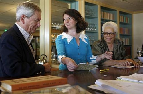
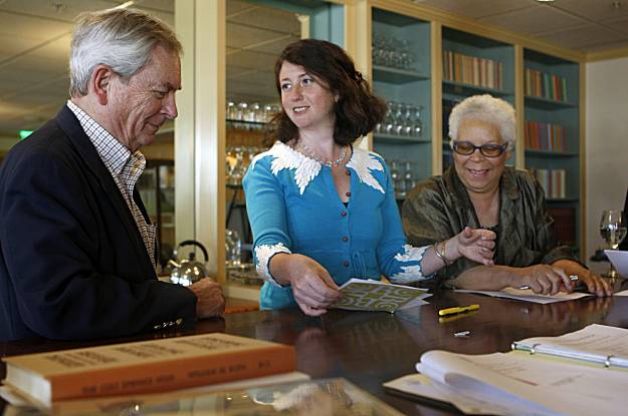
Whyte during his tenure as a Director of the Book Club of California, with fellow Directors Danya Winterman (middle) and Anne W. Smith (right), 2010. (Photo: SF Chronicle/Liz Hafalia)
WHYTE: No, there has not, nor do I expect one. The books are old stuff now, dated, and probably irrelevant to most people.
2W2N: I notice there’s a Neil Gaiman Sandman exhibit going on right now, and the Sandman comic didn’t come out until 1989. I guess Troubador art is illustration rather than comic or cartoon art, but the books deserve an exhibit somewhere. They’re art, and they’re a lasting piece of American pop cultural history.
WHYTE: The original Sandman came out in the 1930s; I remember his gas gun and his cool WWI gas mask—he wore a short, green cape, yet.
Love what you say about the Troubador books: I think I’ll have it bronzed!
2W2N: Malcolm, thank you so much for talking to me. As a pretty awkward kid, I was inspired by all the Troubador books and thrilled that someone finally “got” me. I feel the same way today, and so do many others. Thanks for giving us so many amazing experiences.
WHYTE: My pleasure. Great to know there are those of you out there who “got” Troubador as well. Quite moving in my advancing years.
* * *
© 2013 M.K. Whyte and 2 Warps to Neptune. All images © their respective creators. No part of this article may be reproduced or transmitted in any form without the express written permission of the copyright holders.