Limited edition (1100 copies) ten plate portfolio signed by the artist. All of the pieces here originally appeared on Creepy and Eerie covers except plates one (“Lucy”) and eight (“All Hallow’s Eve”), which I believe are original to this portfolio. Earth Art subsequently released posters featuring the original works (seen below). Interestingly, according to the seller, the posters were given away as carnival prizes.
Archive for January, 2015
Eerie Visions Art Portfolio by Ken Kelly (Earth Art Graphics, 1977)
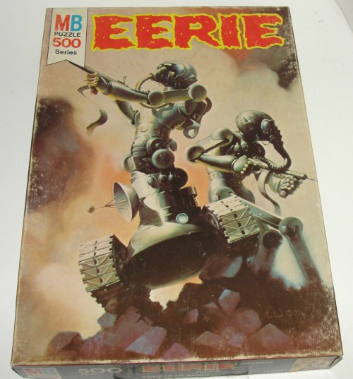
Published January 22, 2015 Fantasy Art , Ken Kelly , Sci-Fi/Space Art 1 CommentEerie Jigsaw Puzzle (Milton Bradley, 1977)
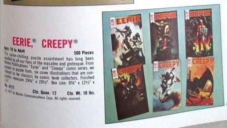
Published January 22, 2015 Comic Books , Jigsaw Puzzles , Ken Kelly , Sci-Fi/Space Art , Warren Publishing 2 CommentsThere were six puzzles in the series, per the entry below from the 1979 Milton Bradley catalog*. I’ve got a close-up of another puzzle here.
The brilliant art on the one above is from Ken Kelly for Eerie #64. Kelly’s cover work is featured on four of the six puzzles.
*The blurb reads
This spine-chilling puzzle assortment has long been wanted by all our fans of the macabre and grotesque. From Warren Publications “Eerie” and “Creepy” comic series, we present in puzzle form, six cover illustrations that are considered to be classics by comic book collectors…
“Considered to be classics by comic collectors” is a backhanded compliment, isn’t it?
(Images via eBay)
Centipede Board Game Designer Interviewed at CHEGheads
Published January 21, 2015 Board Games/Tabletop Games , Video Games Leave a CommentAs some of you will remember, one of my abiding interests is the collision of the board game and video game industries starting in 1980, when Milton Bradley released Pac-Man, “the family version of the arcade game.” I’ve talked about two other MB games, Berserk and Zaxxon, and speculated that board games emulating arcade games were successful in the short-term for a couple of reasons: first, the kids who couldn’t get to the arcades and didn’t have a home console might get a quick fix from a cleverly imitative board game, and second, video games in the golden age were hard as hell, and board games gave players more for their money. Ultimately, both reasons come down to money. No kid with a plentiful supply of quarters would have chosen the dining room table over the arcade.
Shannon Symonds talked to Bruce Whitehill over at the CHEGheads blog about how he designed Milton Bradley’s Centipede (1983), and it’s pretty fascinating. Whitehill couldn’t advance far enough into the arcade game to get a feel for the overall concept, so he fed quarters to a young expert to play and explain what was happening along the way. Whitehill admits that kids would rather have played the video version at the time, and concludes that
Centipede the board game was, I think, more for people like me—those who could never do that well on the arcade game but could hold their own against another player on the dining room table.
The allure of video games in the beginning was that they were video games—the physical world was old hat; we wanted to live out our fantasies on the electronic game grid. The “family version of the arcade game” was a tag marketed to parents who, Milton Bradley hoped, wanted to share in their kids’ arcade experience or, more likely, replace that arcade experience with something less expensive and less troublesome (how many car trips did parents have to make taking kids to and from the arcade?). It’s also worth noting that many arcades were competitive and intimidating, and we often had to play with a slew of other young ruffians breathing down our necks and/or talking trash. A board game at home provided a kinder, more laid back experience.
The bottom line is that tabletop game companies knew they couldn’t overturn the new digital paradigm, and creative designers like Bruce Whitehill kept them in business for a few more years. Today, Whitehill’s version of the game is almost as iconic as Atari’s.
Presto Magix: The Empire Strikes Back (1980)
Published January 21, 2015 Presto Magix/Dry Transfers , Star Wars (Original Trilogy) 1 CommentMore exquisite scans from Mikey Walters. Don’t miss the enlargeable finished (and signed!) product beneath each of the front covers. There were seven sets total for The Empire Strikes Back. We’re missing Dagobah Bog Planet and Ice Planet Hoth.
The first Presto Magix sets appeared in 1978, but no “rub-down transfers” were released in the U.S. with a Star Wars theme. UK company Letraset innovated the dry transfer technique beginning in about 1961, according to Wikipedia, developing children’s Instant Pictures in 1964 and Action Transfers in 1969. There were several Star Wars Letraset “scenes” released in early 1978. The original three can be seen at the brilliant old school Star Wars blog Episode Nothing.
Dungeons & Dragons Power Cycle (Coleco, 1984) (Part One)
Published January 20, 2015 D&D , D&D Non-Gaming Merchandise , D&D Toys , Tricycles 2 CommentsIf you thought the D&D big wheel was a myth, think again. Coleco released a series of Power Cycles throughout the ’80s, this one among them, although I’ve never seen it advertised in any catalog. The pictures aren’t great, and the specimen is pretty beat up, but we can see that the cycle is fashioned in the image of—you’ll never guess—a dragon. I’m betting some sticker highlights have fallen off the face and probably the wheels (see what’s left on the nostrils and the wings). I love the colors.
The Elmore art on the back of the seat, from the box cover of the 1983 Basic Set revision, is the go-to image for all the licenses from 1983-1984, and there are three more pieces on the cycle’s dash. The two on the stem are also Elmore, seen here and here. I can’t identify the image on the very top—could be lenticular.
If anyone has an advertisement for the cycle, or pics of one in better shape, please let me know.
When the Future Was Full of Stars: An Interview with David Jefferis
Published January 16, 2015 Books , David Jefferis , Interviews/Q&As , Space Travel/Exploration , Usborne Publishing , What the Future Looked Like 6 Comments
Unpublished cover art by the late Brian Lewis for World of the Future: Future Cities, 1979. A similar but revised piece was used for final publication.
Serious study of and public interest in space colonization peaked in the 1970s, fueled by the successes of the Apollo program and a youth culture that embraced the speculative sci-fi of Star Trek and 2001: A Space Odyssey. If the idea of hitching a ride on an asteroid outfitted with nuclear motors was utopian, it was also grounded in good sense: by the end of the turbulent 1960s, it was clear to many that the Earth was no longer a place that supported intelligent, compassionate life.
A number of books on the subject helped to launch “space activism” in the popular imagination, starting with Princeton physicist Gerard O’Neill‘s The High Frontier: Human Colonies in Space (1976). Due largely to O’Neill’s efforts, Stanford University and NASA collaborated to produce a series of detailed studies on permanent space settlements that continue to inspire the present-day pioneers behind SpaceX and the National Space Society.
In 1979 Usborne’s landmark The World of the Future series, penned by David Jefferis and the late Kenneth Gatland, presented youngsters with a vivid, exciting, and ultimately uplifting vision of the future—many of the authors’ predictions came true, as well. Even today, the books hold up the notion that living a better life among the stars is not just a worthy aspiration, but a worthy aspiration within reach.
* * *
* * *
2W2N: How did you get involved with Usborne Publishing? I notice that you were responsible for art and editorial direction on the World of the Unknown series before you worked on the World of the Future series.
JEFFERIS: Some background, prior to my Usborne days:
My first job was in London, in the Art Department of The Observer Sunday newspaper, producing news graphics—maps, diagrams, drawings, charts—to highlight stories for printing in the newspaper’s weekly edition. I was soon involved in other aspects of the production, such as magazine covers, and started to create features of my own, including articles for the “Young Observer” page, DIY hi-fi systems, and so on.
One such “Young Observer” article was an interview I carried out with a Brixton man who was building a man-powered helicopter in his (small) front sitting room. He had to disassemble his machine to extract it from the front parlour, but did go on to screw it together again and test it on an airfield. Sad to say, he managed only a short hop off the ground. Enterprising though, and I hugely respected his tenacity and skill in creating something from nothing.
I worked part-time for The Observer after a while, during which time I did many illustration jobs, and this brought me into the world of book publishing, and children’s books, for which there was steady demand for the realistic art I produced. I worked with Macdonald Publishing quite a lot, and specialized in creating pre-World of the Future “science faction” futurist spreads in their non-fiction titles.

From a 1977 Observer magazine released to coincide with the London Auto Show. Jefferis: “The city car resulted from a concept-crunching session with journalist Peter Deeley, and included a joystick instead of a steering wheel, full-auto drivetrain, electric drive with slot in-out batteries (you weren’t first, Tesla!) and rear-facing back seats…”
I met Peter Usborne as one of a number of editors and publishers I had targeted as possible backers for a magazine concept I created called Science Fiction Illustrated. This starred the 1950s comic hero, Dan Dare, Pilot of the Future, on the cover, and—as all such things were in those days—the sample dummy for Science Fiction Illustrated was crafted by hand (mine, in this case!) with rub-down Letraset headlines, and so on.
Peter and I got on well, though he was not interested in being a periodical publisher. Some time later, an editor who worked with him in his newly-formed Usborne Publishing company gave me a call, and I started working as a freelance designer for the company.
I had offices in Covent Garden at the time—and had published the weekly “Tuesday Paper” for children there, along with other projects, such as “Lightning” for the National Magazine Company—so working in league with Usborne was a fairly natural next step, especially as our respective offices were on the same side of the street, opposite the Garrick Club.
Freelance design turned into art direction, which turned into art and editorial direction for the first Usborne book series in my charge, a five-title set called Battlegame Books. Later multi-title series—by which time I was on the payroll in charge of science, technology, and gee-whiz titles—included Young Scientist, Young Engineer, and as you noted, World of the Unknown.
2W2N: On the World of the Unknown books, what exactly did “art and editorial direction” entail? Did you do some of the illustrations as well? I’m also curious how the project was conceived. On the one hand, the art draws out the shocking and graphic nature of the subject matter (especially in All About Monsters); but on the other hand, the narrative is even-handed, even skeptical, and the tone is almost droll at times. It reminds me of the brilliant Hammer horror films of the ’60s and ’70s. Was that the idea?
JEFFERIS: The A&ED title is one that I invented, as I covered both named roles, rather than being responsible for either art or editorial.
I did a few small illustrations for these Usborne books, just fillers really as there wasn’t time to do more. Also, I had made a decision to move away from full-time freelance illustration, as it was so labour intensive and demanded too much time spent with only a drawing board for company. As quite a physical person, I wasn’t keen on the endless hours hunched up indoors, particularly with the amount of intensive preparation and repetitive work that my style of airbrush art demanded.
I’ll tell you how the change of direction happened. I was working on a “future faction” spread for Macdonald Publishing, the subject an underwater fish farm, with aquanauts zipping along, dolphins equipped with sensor packs, work domes, mini-subs, and so on. The background to the work was, naturally enough, a luminous blue-green ocean, fading into the distance. I sprayed endless fine coats with the airbrush, each layer just molecules thin, as I slowly built up the colour depth. For some reason, I hadn’t worn my surgical mask this time—and so I spent much of the following week sneezing and coughing out blue-green ink. Ugh. Today, health and safety would have words to say, and even then I didn’t feel like repeating that mistake again! The artwork looked okay though.
So far as World of the Unknown is concerned, the tone of the books fitted in with the nature of a then-new educational publisher. The idea was to draw readers in with bold visuals, then be responsible with what we were saying. It wasn’t actually defined as such, but there was an echo of the old Eagle comic there, which had done a similar sort of thing. My own book series featured mostly realistic artwork, but other Usborne output used humorous illustrations, produced by artists such as the late Stephen Cartwright.
What was deliberately avoided was a true strip cartoon approach. The British educational establishment of the day was mostly dead-set against anything that looked too much like a comic, as were educational book publishers. That said, Stephen Cartwright’s gently amusing art became hugely successful in books aimed at younger readers, and rightly so.
Two tales of World of the Unknown spring to mind. In All About Ghosts, one spread featured the village of Pluckley in Kent, a place reputedly packed with supernatural phenomena. Writer Chris Maynard spent time there with a photographer, but they didn’t see or take any pictures of any spooks, and it took some head-scratching and burning of the midnight oil back in London for us to end up with a useable spread! It’s worth worth pointing out my methodology there, which was to work with contributors, aiming for a team effort.
On All About Monsters, I spent several days around Loch Ness looking for the mysterious beast, with no convincing results. The art I commissioned from Malcolm McGregor looked extremely good, but the printed results of my own researches came to no more than a couple of pics and a mini-map! I revisited the subject recently, and produced a prototype eBook, The REAL Loch Ness Monster, available here.
This time Nessie was the solitary star and focus of the book, so it was good to do some in-depth research. Just as important, the research paid off with a scientifically elegant and believable theory—of which the Oxford University experts approved!
In the early days, I did visuals for every page, breaking down information into the box-by-box sequence approach being pioneered at Usborne. There were plenty of variations used at Usborne for other series and titles. For example, the illustrator Colin King did his own pencil roughs when working with in-house editor-writer Judy Hindley on How Your Body Works.
In summary, my titles may have been aimed at young readers, but they didn’t talk down to them, the text level being easy to understand, but not stupid. The information in a typical book could have been published in any intelligent, mid-market newspaper.
2W2N: You wrote the World of the Future series with the late Kenneth Gatland, who had by that time written a number of titles for Usborne relating to space travel and space exploration. How did you meet Ken, and can you tell me how World of the Future was developed? I imagine it was inspired by all the space colony concept work NASA did in the 1970s. Was it also banking on the massive success of Star Wars?
JEFFERIS: At that time, Kenneth Gatland was past-President of the British Interplanetary Society, a highly respected organisation, known for its pioneer work in outlining designs for Moon landers back in the 1950s, and for the Starship Daedalus concept in the 1970s. The BIS was a natch for technical support on the World of the Future, so I called Ken, a quietly spoken man, full of ideas and a pleasure to work with. I had worked with him on an earlier Usborne title, Young Scientist: Spaceflight, and we were both keen on this new project.
Regarding the genesis of World of the Future, I’m not sure who actually came up with the idea, Peter Usborne or myself. Either way, the series came out of a short meeting in Garrick Street, and I went away fired with enthusiasm. Was Star Wars an influence? To a degree, yes, but there were other big sci-fi movies at the time too, the most influential probably being Stanley Kubrick’s far more serious 2001: A Space Odyssey. Usborne was an educational publisher, so we had to be seen to be fact, not fiction. And of course, space was a popular subject with our principal markets: children and parents, educators and schools.
A big influence came from childhood, in the form of Frank Hampson’s Dan Dare, Pilot of the Future. The panel-by-panel presentation of the Eagle comic was similar to the Usborne educational style we had developed, and had Hampson been available for World of the Future, I would have been delighted.
Blue-sky thinking from NASA and other space organizations was huge, and Ken Gatland’s BIS connections made a huge difference to the ease of accessing photos and prints, as well as library material to which he had access. I too had a large and growing library, so between us we had call on impressive information resources. Today, my library has been mostly digitized or sold on to collectors via eBay.
Early on in the World of the Future project, Ken and I agreed on an outline flatplan—a small-scale, spread-by-spread book visualisation—which allowed each double-page spread to be effectively self-contained, though presented in a logical sequence. The three individual World of the Future titles were 32 pages each, allowing a dozen spreads to tell the story, the rest consisting of prelims and introduction, timeline and index.
I drew up detailed full-size page visuals in pen and marker, making adjustments and changes with Ken until we were both okay with the content. Once a spread was locked down, I then commissioned an illustrator to create finished art, based on my visuals. A reference pack of images, photos, books, magazines—whatever was needed—was posted off, with phone conversations on arrival, to ensure that the illustrator understood the brief properly. It’s a shame that those visuals of mine went in the bin, as they were a tremendously important part of the book creation process. But storage was a huge issue, and once finished art arrived, they were dead meat.
As a side-note, it’s worth knowing that back then, making illustrated books was a highly physical business. World of the Future was created before the Internet, or even faxes, and that meant continuous multi-way movements of hardcopy information. Reference books, clippings, sketches, notes—all had to be sent and returned by post, messenger, or rail. It was slow and expensive. In today’s money, delivery of some rigidly-packaged finished-art boards using rail and messenger bike might cost $200 USD or more, a sum that could be repeated multiple times during production. If changes were needed on a piece of art, the two-way delivery process had to be repeated. I am very pleased that no one has to waste time and money like that any more!
2W2N: Futurism these days seems much less exciting than it was when the World of the Future series debuted, revolving mostly around self-centered—and somewhat frightening, to my mind—internet and virtual reality technologies (i.e. Google Glass, Oculus Rift). What happened to exploring the universe outside of us and building bold new worlds?
JEFFERIS: I think the term ‘exciting’ depends on what you mean. The star-spanning world of the future envisaged by me and others was certainly exciting in a gee-whiz sort of way, but some of the more way-out space ideas were products of technical naivety as much as anything else. For example, the 1950s sci-fi hero Dan Dare flew spaceships like they were Spitfires, with navigation carried out with the flick of a slide-rule.

From 1977 to 1979, Jefferis wrote and illustrated the Starcruiser comic strip for ‘The World of Gerry Anderson’ feature in Look-In magazine.
And—bearing in mind our target audience—we deliberately left out political messages in World of the Future. But perhaps we shouldn’t have, for even then Apollo was teaching us that while political will can achieve many things, including going to the Moon, elected leaders don’t have sufficient time in power, and therefore the long-term vision needed to command vast budgets for decades at a time. Without the will, the time, the money, visionary ideas will fail. I got rather depressed about it all for a while, especially as I had drawn up in 1970 a nuclear-powered Mars ship concept, based on von Braun’s ideas. His timeline was, “…the early 1980s.”
But we are now in a better place, where I see entrepreneurs like Elon Musk and Richard Branson achieving great things by virtue of their foresight, drive, and access to finance. It’s my belief that if future spaceflight is fueled by commercial profit more than pure politics, then out into space we’ll go.
Which is not to say that organizations like NASA or ESA (European Space Agency) are redundant, far from it. Plans and intentions are as dramatic as ever, and I would certainly like to see the ‘floating buoy’ Titan probe go ahead in the not too distant future. But space agency budgets will always be at the mercy of headline-grabbing budget-cutters, so let’s just say that I heartily approve of the commercial sector flying space missions too.
Whether such blue-sky dreams as warp drive or other faster-than-light technologies will ever appear is unknown at present, but people like Miguel Alcubierre and Harold White seem to have opened the conceptual door just a crack, and with it, perhaps a gateway to new worlds—the stars our destination, to paraphrase Alfred Bester. The Lockheed Martin Skunk Works may also play a role if compact fusion lives up to its promise, with Earth-to-Mars trip times of just one month a possibility a decade from now.
As for internet and virtual reality technologies, they are a growing part of our present future, one that was largely unforeseen, though Ken Gatland and I did our best. I’m guessing that they will blend seamlessly into our lives, in the same way that personal computers and mobile phones have done. However, I don’t see too much in internet technology that is going to change the actual nature of humanity. We are still much the same as, say, the citizens of ancient Rome, many of whom would probably fit into present-day Western culture without too many adjustments, though having machines to do their bidding instead of slaves might be hard to accept. In fact, give a time-slipped Roman some money, and a few servant-slaves would probably be installed in no time at all.
Access to the internet is on its way to becoming ubiquitous, though it’s not exactly an overnight process. I am still amazed and unamused that where I presently live, connections are frustratingly slow and patchy, and mobile phone communications even worse. Despite this, things will improve in years to come—so they tell me!
As for the future, I’m guessing that the internet is in the early stages of becoming the brainstem of a planetary AI of some sort, perhaps one in which humans function as semi-independent mobile elements. Note the ‘semi-independent’—I’m not alone in not wishing to be cut off for more than a few hours, and need my regular information fix. One thing is for sure—my various laptops have functioned as a second brain for many years.
And we previewed the Apple watch by a long way—though we called it the ‘Risto.’
2W2N: You are still active in writing, publishing, and futurism, and you’ve described yourself as a “solar evangelist.” Can you tell me more about your current projects?

Unpublished Jefferis sketches depicting (top) a high-end home equipped with gravity control, and (bottom) a concrete-and-glass Museum Building covered with bio-engineered climbing plants “designed to look good and provide a freshly-grown food supply.”
JEFFERIS: The solar evangelist tag is a direct descendent of ideas that Ken Gatland and I promoted in World of the Future, and you can see what I mean on the jacket for Future Cities. Look closely and you’ll find a solar-powered house, an idea that’s now hit the mainstream, with rooftop panels widely available to homeowners. I have been working with an excellent renewables company, and we feel we are helping to save the planet in a commercial environment, much as SpaceX and Virgin Galactic are aiming to profit from space, or Tesla with electric cars. Incidentally, automated battery-swapping at recharge stations is an idea Ken and I pioneered, and at last something of the sort is coming to fruition.
As for solar, according to some estimates, in the United States alone, a home or business goes solar every four minutes. To put the following numbers into perspective, one gigawatt of electricity is enough to power some 750,000 homes. China smashed the record for new solar installations in 2013 by adding 11.8 gigawatts, bringing its total solar capacity to more than 20 gigawatts.
China is now second to world solar leader Germany, which is nearing the 40 gigawatt mark. On June 9, 2014, German solar supplied 23.1 gigawatts, more than half of the country’s total energy demand. So it’s an exciting time for me—reaching into the past to power the future.
Despite all that, publishing remains my first love, and my stuff ranges from books to prints.
My website www.starcruzer.com will shortly become the launch pad for ebooks, such as Ness: Hunt for the Loch Ness Monster. This is a ‘Visual Companion Edition’ of The REAL Loch Ness Monster, with a double-page visual of the monster we think lies behind the legend.
2015 titles include Space Probes, Space Stations, Black Holes, The Aces, to be published on an ebook-a-month basis on Amazon for Kindle and other e-readers. In addition, I will be establishing a presence on the micro-funding site Patreon.
Prints: I haven’t produced illustrations for book publishers in a long time, but I still draw for myself. I also love photography, probably spending more time tweaking in Photoshop than I ever did in creating airbrush art. I plan to showcase art and images on Saatchi Art in 2015.
________________________________________
As of now, you can read a compilation of all three books in The World of the Future series at the Internet Archive.
The World of the Future: Star Travel (Usborne, 1979)
Published January 15, 2015 Books , Usborne Publishing , What the Future Looked Like 3 CommentsSelect pages only. Futurist and illustrator David Jefferis edited and co-wrote all of the volumes in Usborne’s influential World of the Future series (1979), which introduced a generation of kids to ideas few adults could grasp. While Star Wars had nothing of the speculative in it, Usborne and Jefferis understood that it could serve as a gateway drug into space science and more serious explorations of our interstellar future.
I was really lucky to talk to David, still very busy thinking and writing about the future, about his Usborne days and beyond. That interview will run tomorrow.
UPDATE: Mr. M.W. Schmeer has kindly notified me that the compilation of all three World of the Unknown books is online at the Internet Archive.
Manhattan Miniature from Escape from New York (1981)
Published January 14, 2015 '80s Movies/TV , Escape from New York , Sci-Fi Production Design , Special Effects/Visual Effects , What the Future Looked Like 8 CommentsIn the first two photos, Bob (dark hair and beard) and Dennis Skotak, two legends in the visual effects field, work on the model. In the third, Bob inspects the finished product. To achieve the computer navigation sequence as Plisken is flying his glider into the city, reflective paint was applied to the edges of the black buildings, which were then shot under black light. While reportedly James Cameron’s idea, it was almost certainly John C. Wash. Cameron was a director of photography on the film (as was Dennis Skotak), and he did some great matte work as well.
(Images via Matte Shot and Fuck Yeah Behind the Scenes)
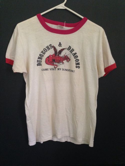
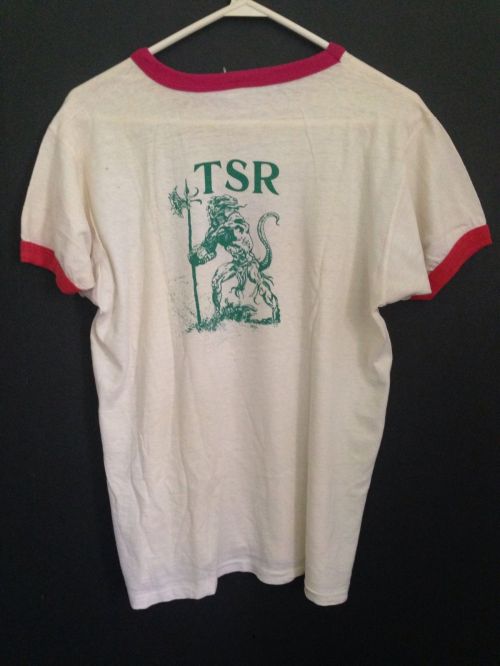
Dungeons & Dragons/TSR T-Shirt, Circa 1976
Published January 14, 2015 '70s Decor/Design/Fashion , D&D , D&D Non-Gaming Merchandise , TSR 5 CommentsA real beauty, presumably sold at The Dungeon Hobby Shop. The dragon illustration is by Bill Hannan, taken from the cover of Dragon #1 (1976) and later used for the cover of TSR’s Days of the Dragon Calendar (1980).
Item sold on eBay a while back for just over 20 bucks.
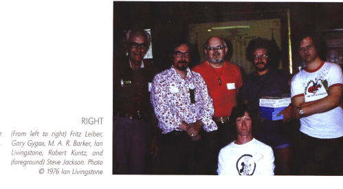
UPDATE (1/19/15): Thanks to some digging by Zenopus Archives at The Acaeum, Scott Moberly posted the below photo from Gen Con IX (August, 1976) showing Rob Kuntz wearing the shirt. I’ve changed the production/availability date on my post accordingly. (The Dungeon opened in April 1976, and Ernie Gygax confirmed that he remembers the shirt well.) I’ve got a Gen Con XI t-shirt here, by the way.
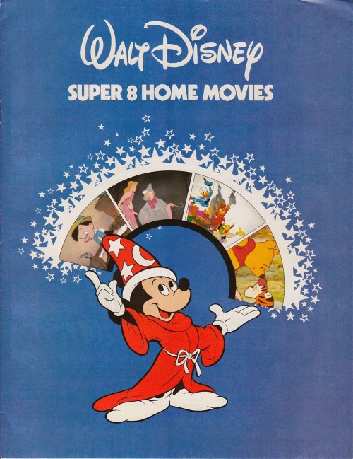
Walt Disney Super 8 Movie Catalog (1980)
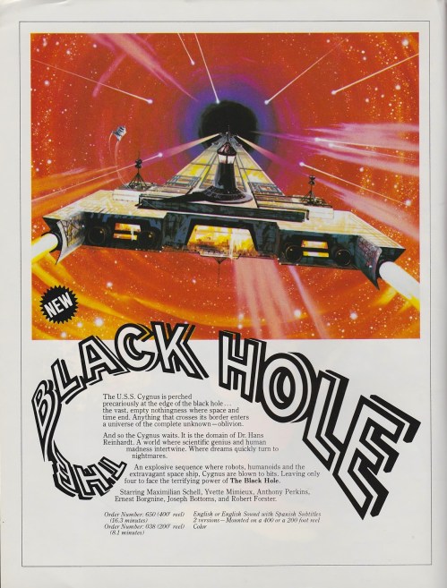
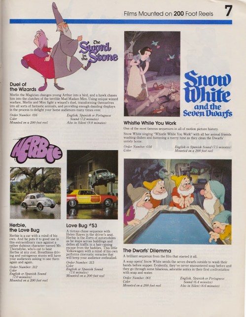
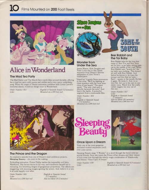
Published January 13, 2015 Black Hole, The , Catalogs , Disney , Disney Movies 1 CommentCourtesy of Tom at Garage Sale Finds, where you can flip through the whole catalog. I suspect the (costly) films here were purchased primarily by elementary schools, because I remember watching a number of Disney flicks on the trusty projector in the 1970s. They were always the second tier films, though: Herbie, Snowball Express, The Apple Dumpling Gang, etc. I would have jumped around like a delighted madman if one of the teachers had busted out The Black Hole.


