
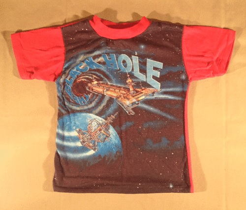
More Black Hole tees here and here. The red one above is the best by far. (Kid sizes only, nerds. Sad face.)
Surveying the Gen X landscape and the origins of geek


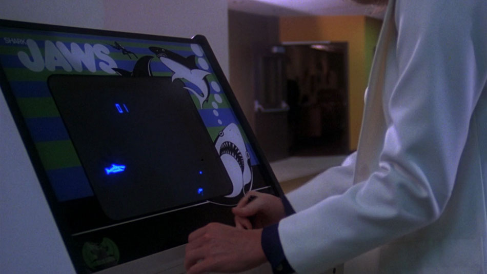
There’s an excellent article by Keith Stuart at The Guardian about Spielberg’s early interest in video game and computer technology (his father was an electrical engineer) and how the shot of Killer Shark (1972) at the beginning of the film perfectly encapsulates the entire narrative: “It’s effectively Brody’s nightmare, and his objective, rolled into one flickering image on an ancient coin-op display for a few redolent seconds.” Stuart continues:
In a movie filled with legendary cinematic moments, this brief sequence is a minor one, but as with many other elements of Steven Spielberg’s 1975 picture, it was also prescient. The director, a keen games player and watcher of pop culture trends, foresaw an era in which Hollywood would be seduced by the popularity and the visual spectacle of the emerging video game arcade scene. He got the appeal of these new entertainment machines, but he also understood how computer graphics represented a new way to present narrative to audiences – even if, in Jaws, it was a few seconds of footage.
As Stuart notes, Killer Shark was actually Sega’s last mechanical game, not a video game, the shark animation a result of a projector inside the cabinet. You can also see Computer Space (1971), the very first commercial coin-op video game, in the background of the same shot.
In the Roger Corman-produced Piranha (1978), a brilliant Jaws and eco-horror parody written by John Sayles and directed by Joe Dante, there’s a shot (below) featuring Atari’s Shark Jaws (1975): sort of a parody within a parody within a parody.
(Images via Jaws Wikia, Pinterest, and The Electronic Playground)


We could argue about what the best piece of Jaws tie-in merchandise was, but why bother?
(Image via eBay)

The ad ran in the trades shortly after Benchley’s novel came out in February 1974—I’ve seen it for sale with “in preparation” written around the borders. Zanuck and Brown read the novel and bought the film rights before it was even published. Looks more like it’s going to be a Roger Corman picture, based on the exploitation concept and lurid art, a point Corman has always enjoyed making:
Vincent Canby wrote in the New York Times: “What is ‘Jaws’ but a big-budget Roger Corman film?” What he didn’t say was it was not only bigger but better. I’m perfectly willing to admit that. When I saw “jaws,” I thought, I’ve made this picture. First picture I ever made was “Monster From the Ocean Floor.”
The book seen in the ad is the hardcover edition, with a cover illustrated by Paul Bacon. Roger Kastel redid the cover for the paperback, and it was his art that was used for the film. I have a very high opinion of both Spielberg’s film and Kastel’s poster, though the novel is awful.
Jaws turned 40 years old on June 20th.
(Image via Blu-ray.com)

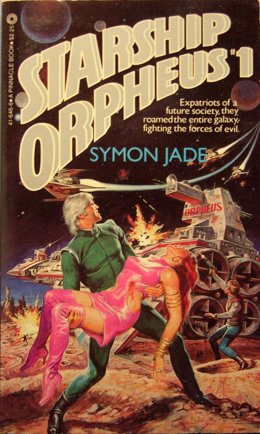

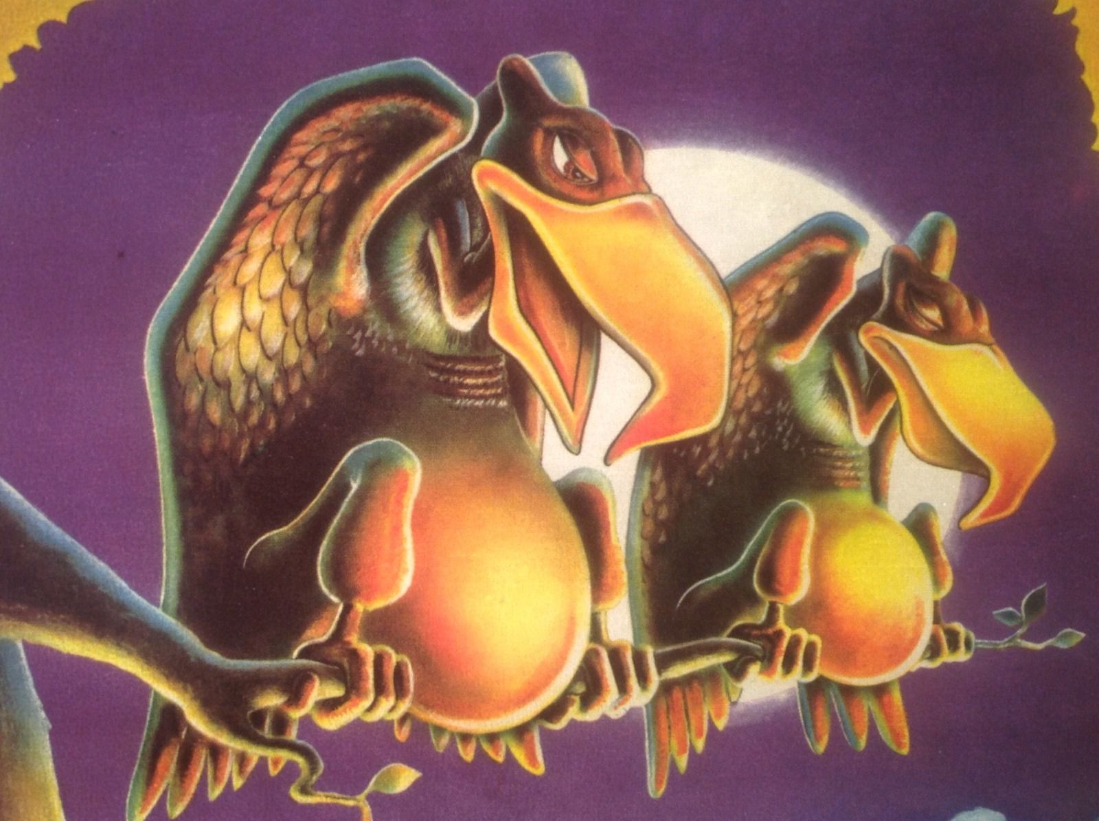
Little known Norem covers for the first two books in Symon Jade’s (a.k.a Michael Eckstrom) Starship Orpheus series. (The third and last book in the series was illustrated by Jerry Bingham.) You have to admire the pink leather dress and boots on the damsel in distress. Clearly Norem found it amusing, because he signed his name in pink.
Norem didn’t illustrate many adult-oriented sci-fi/fantasy paperbacks. I’m sure he was making better money on booming kid’s properties at Marvel and Mattel. He did paint all 18 covers for Avon’s Wizards, Warriors & You role-playing books, and all six of Ballantine’s G.I. Joe: A Real American Hero young adult novels.
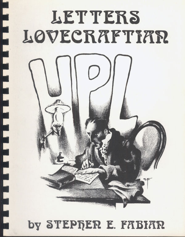

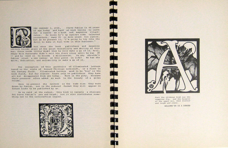


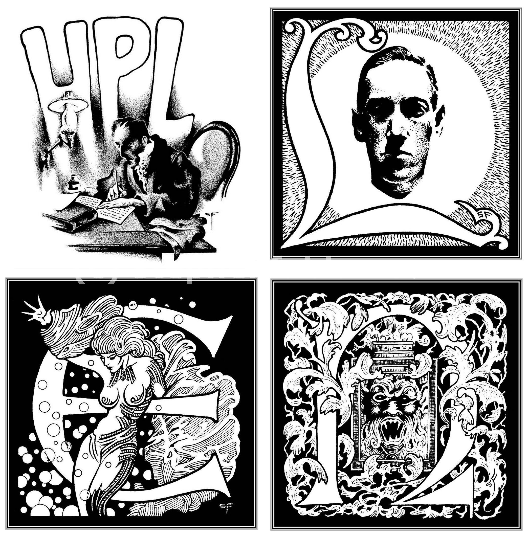
If you’re new to Stephen Fabian, Pinterest has a pretty good sample. I didn’t know that he gave up his career as an aerospace engineer at age 37 to pursue a career as a professional illustrator, and that it took him only seven years to hit the big leagues. Letters Lovecraftian was published one year before he was nominated for his first Hugo Award for Best Professional Artist. Fabian’s biggest artistic influence is Virgil Finlay, a definitive illustrator of Lovecraft and Weird Tales and a favorite of Lovecraft’s.
Letters Lovecraftian was commissioned by Fabian’s friend and patron, sci-fi and fantasy bookseller-publisher Gerry de la Ree (1924-1993), whose house/shop Fabian had first visited in 1955. “When I entered his home,” Fabian says,
I found myself in wonderland, beautiful paintings by famous SF artists hung on all the walls above the many bookcases that stretched around the room. The bookcases were all filled with rare science fiction and fantasy books. My sense of wonder was overflowing, and by the smile on his face I could see that Gerry knew how I felt. As I looked around, it never entered my mind that one day I would see my artwork displayed up there with all those wonderful artists, and that I would be part of that wonderland.
Fabian also tells the story of visiting Gerry for the last time, almost 40 years later:
One dreadful day Helen [Gerry’s wife] phoned to tell me that Gerry had only a day or two to live and would like to see me. It was a time of great sorrow. When I got there he greeted me at the door looking as normal as I’d ever seen him, though I knew that he suffered from sugar diabetes. During the next hour or so nothing was said about his imminent passing, and I don’t remember what we talked about because my mind was so numb from the shock of what was happening. I do remember that when the time came to leave, we looked at each other, there was an unspoken understanding that this was the final goodbye. We hugged and I left in a kind of daze. A few days later he was gone, and I’m still amazed when I think of how calm and ordinary his demeanor was during that last visit. Just before I left he waved at his magnificent library of rare and very expensive books and asked me to take any book I wanted. I couldn’t do it. Instead, there was a small plastic model airplane that a neighbor’s kid had made, and I took that because he insisted I take something to remember him by. And just like that, a truly wonderful part of my life was gone. That small plastic model airplane that I took sits on a bookshelf in my library and every time I look at it, and the tiny pilot that waves at me, I think of him.
(Images via Stephen Fabian and Stuart NG Books)

Stag, 1965

Male, 1966

Men, 1966

Male, 1967
Men, 1967

Man’s World, 1969
For Men Only, 1970

Male, 1974

Male, 1974
Male, 1975
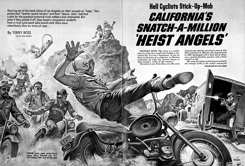
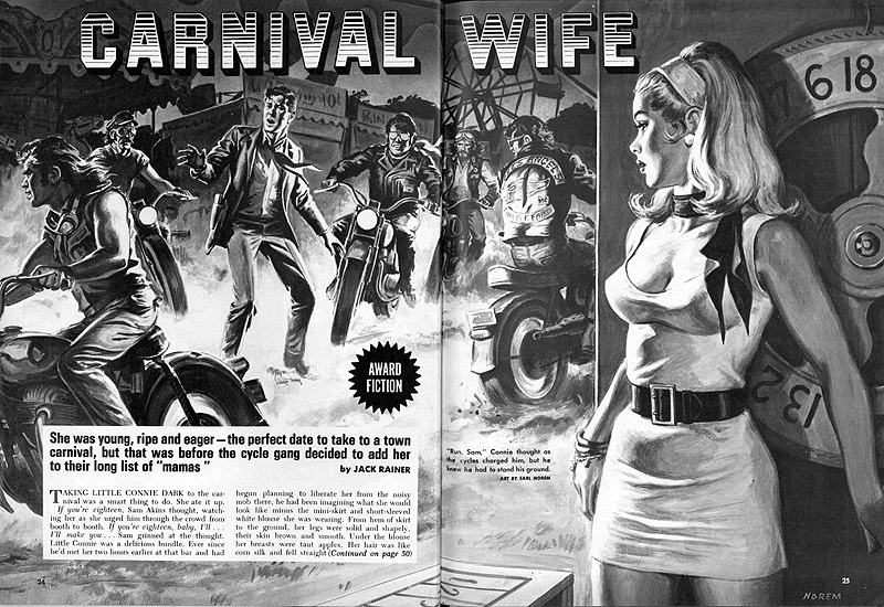
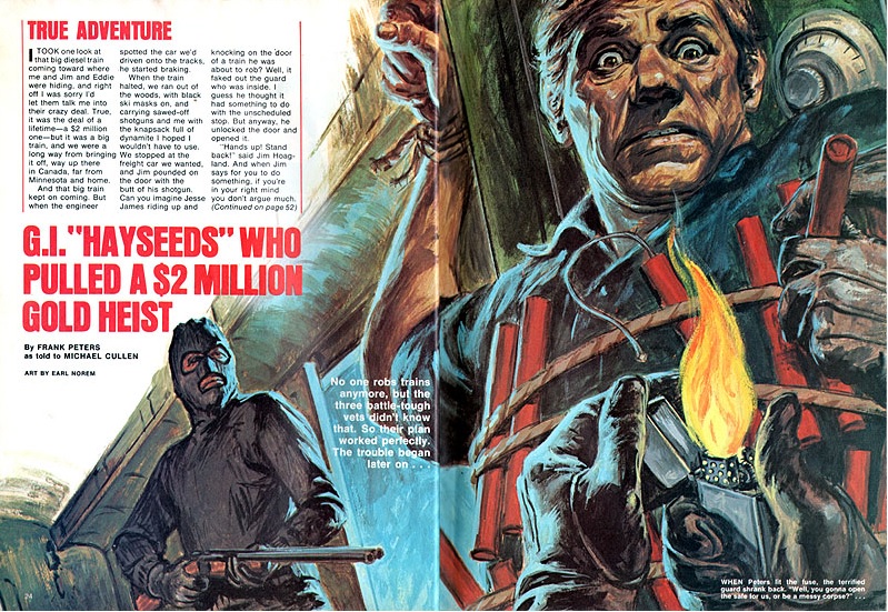
If you haven’t heard, Earl Norem passed away on June 19th at the age of 91. I’ve talked about Norem often, as he is one of the greatest and most influential commercial illustrators of the late 20th century, and a definer of many of the franchises that are now geek canon. Before he started working in comics and related media, however, he had a long and very successful career painting heroes who were only slightly less superhuman. Since his men’s pulp phase is most likely to be ignored—either because it’s distinctly (and necessarily) politically incorrect, or because it doesn’t feature He-Man—I wanted to post a very small sample of his elite output for the genre.
Norem, who served in the distinguished 10th Mountain Division in World War II and was wounded when the Allies advanced into the Po Valley, was perfectly aware of the absurdity of mounting a .30 Caliber Machine Gun on a surfboard, but his job was to sell magazines, and that’s exactly what he did. Professional illustration was a hard, competitive business, and there was no room for sentimentality or grandstanding. Norem took the confines of the particular layout he had to work with and made us look, long and wide-eyed, whether it was a zombie exploding out of a grave or a circus bear smacking around Nazis.
Norem’s range was incredible, and his success and longevity within so many different markets—from Reader’s Digest and Field and Stream to Great Illustrated Classics to The Six Million Dollar Man and Dungeons & Dragons—is a testament to his superior talent. He left behind an enormous body of work that, I hope, will one day get the serious recognition it deserves.
(Some images via American Art Archives and Flickr)
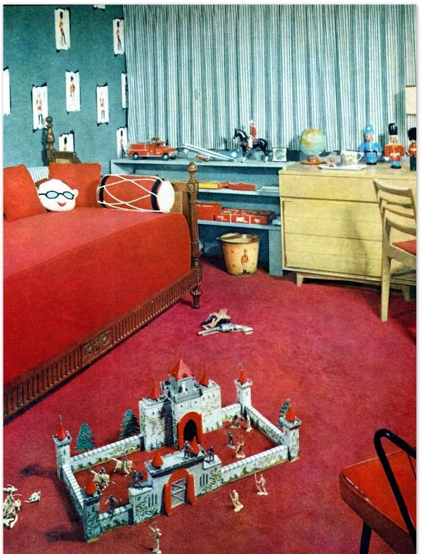


Part one is way back here. The castle in the first photo is Marx’s Robin Hood Castle Set from the late ’50s.
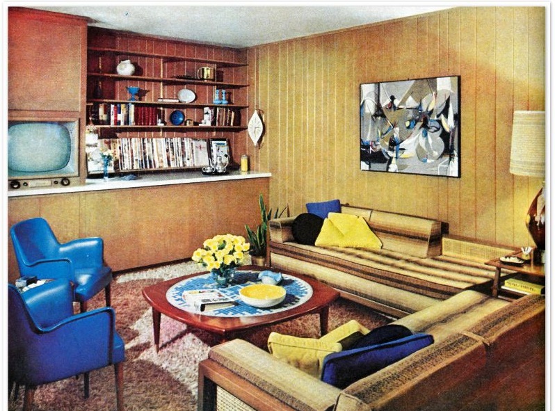
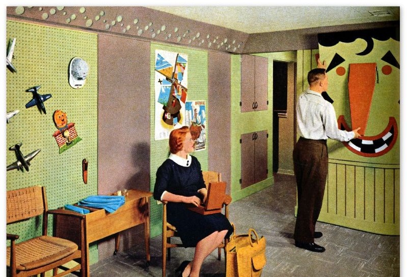
The beautifully trim world represented in these images never existed, but isn’t it comforting to imagine it did?


A different version of the “Patience My Ass” print is seen in these college dorm photos from 1972.
More Roach Studios here.
(Images via eBay)


